Dining Brochure
Food marketing is more than tempting photography, it is about narrating flavour, setting ambience, and guiding diners through choice. This was the foundation of the Dining Brochure, a quarterly publication designed for the Macau Jockey Club (MJC) to promote seasonal and festive menus across its four signature restaurants located at the Hong Kong Macau Ferry Terminal.
Serving both local and travelling guests, the brochure’s role was to act as both an informative guide and a brand experience extension, introducing each restaurant’s unique culinary personality while showcasing key dishes for the season.
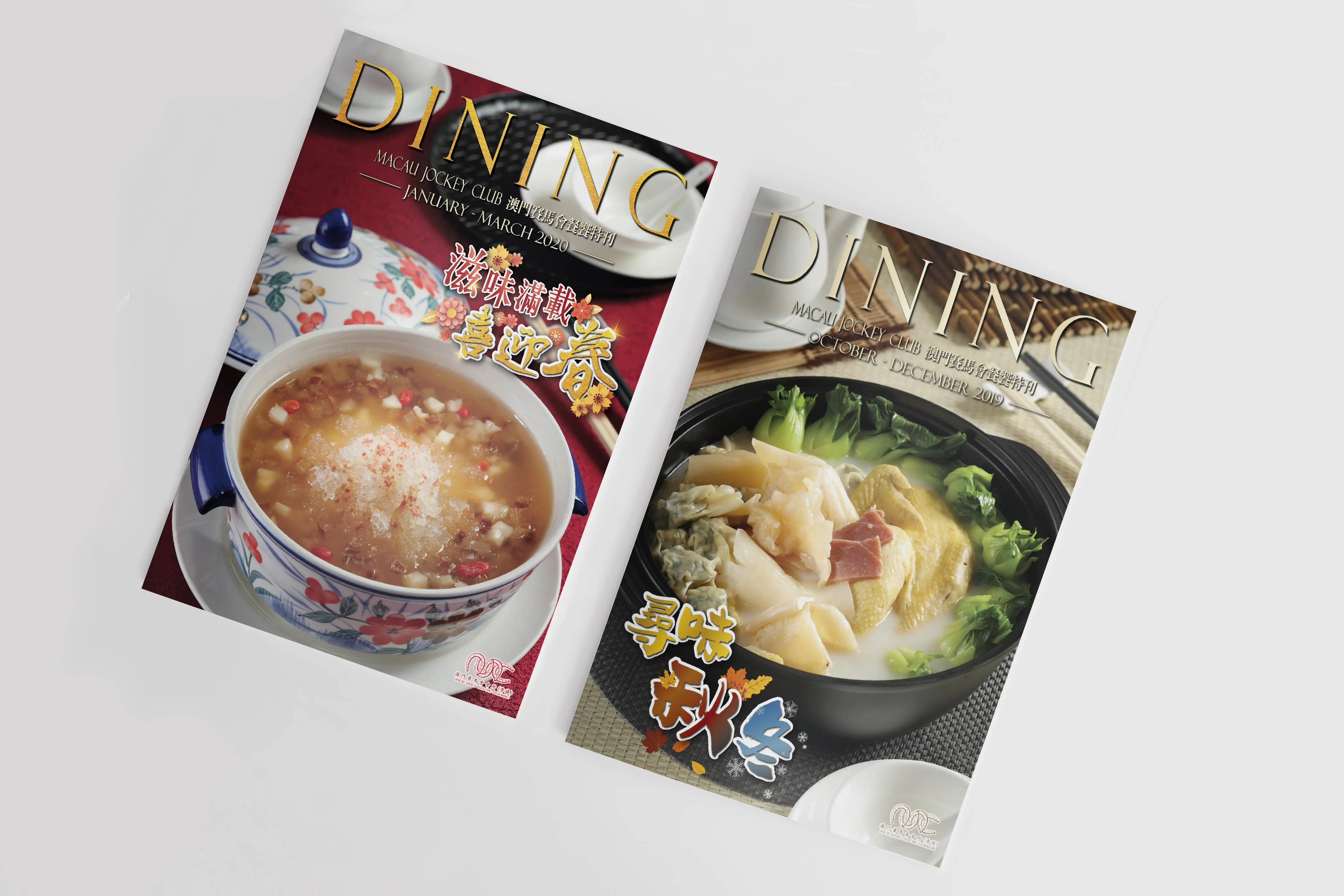
Unlike standalone posters, which focus on a single campaign or seasonal highlight, the Dining Brochure was created to bring together all four restaurants under a unified publication. Each issue followed a quarterly cycle, aligning with seasonal ingredients, festive periods (such as Lunar New Year, Mid-Autumn Festival, or Summer Delicacies), and promotional events.
The brochure needed to:
- Maintain visual harmony across four brands
- Provide concise yet enticing menu descriptions
- Differentiate the restaurants clearly and effectively
- Reflect the elegance and exclusivity of the MJC dining experience
It was placed prominently at restaurant entrances, concierge counters, and waiting areas—serving as both a browsing piece and a takeaway for diners.
The content of the brochure was derived from the same promotional material used in restaurant posters, but extended to include:
- A short introduction for each restaurant’s menu or culinary concept
- More detailed dish descriptions
- Consistent formatting for pricing, ingredients, and booking prompts
- Occasional chef notes or ingredient highlights
To ensure a seamless and cohesive visual experience, the layout was redesigned from scratch rather than using poster templates. Each section followed a similar structure to retain consistency, with adjustments made for text volume or visual hierarchy.
Since the brochure showcased four distinct restaurants, a colour-coded layout system was introduced to help readers easily distinguish between them:
- Golden Restaurant, highlighted in warm gold and beige tones to reflect modern Cantonese dining
- Golden Dynasty, featured regal reds and deep greys for a premium Chinese banquet style
- Yo Ro Ko Bu Japanese Restaurant, used cool blues and neutrals inspired by minimal Japanese aesthetics
- Full Moon Shanghai Restaurant, presented in deep jade greens with ivory, evoking the elegance of Shanghai dining
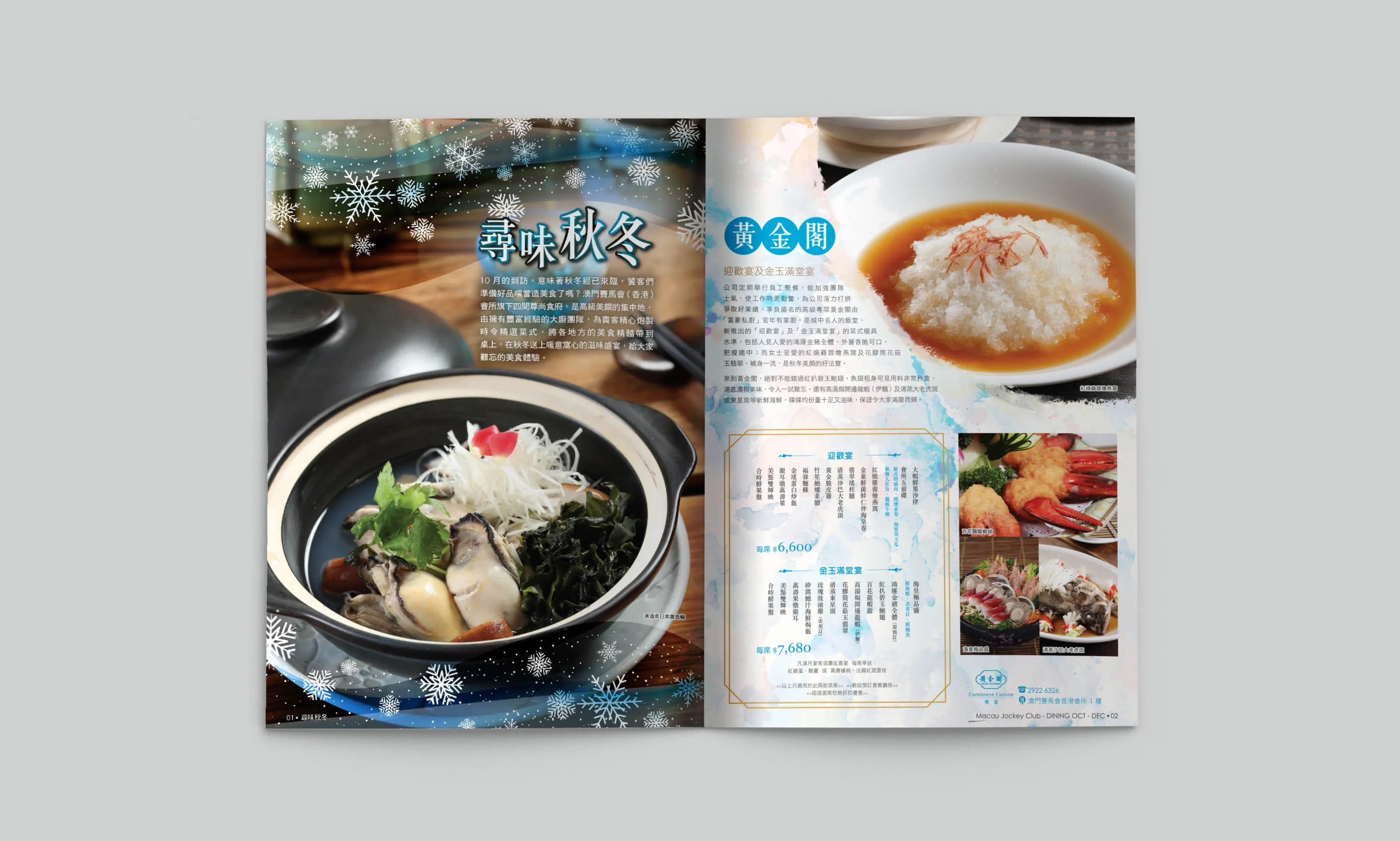
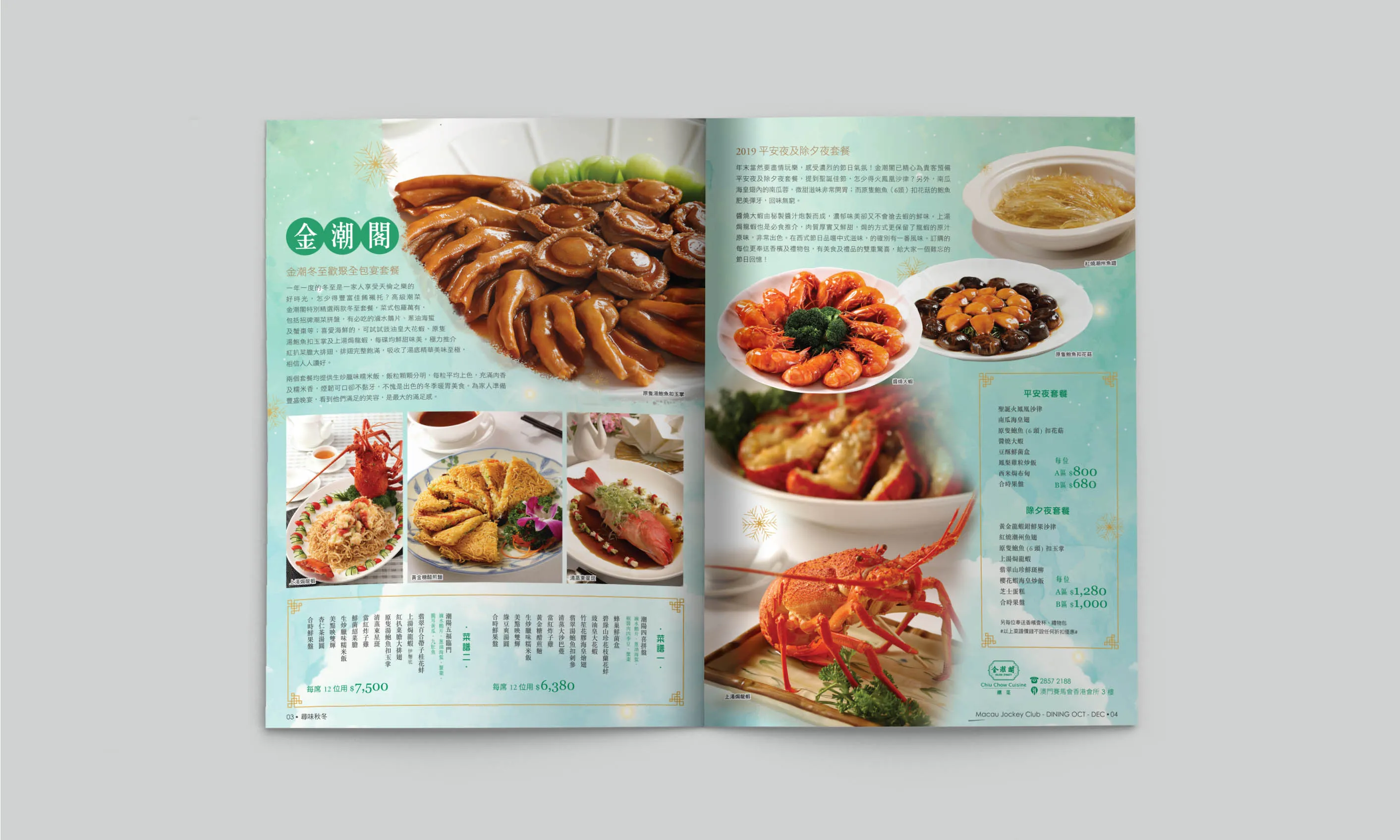
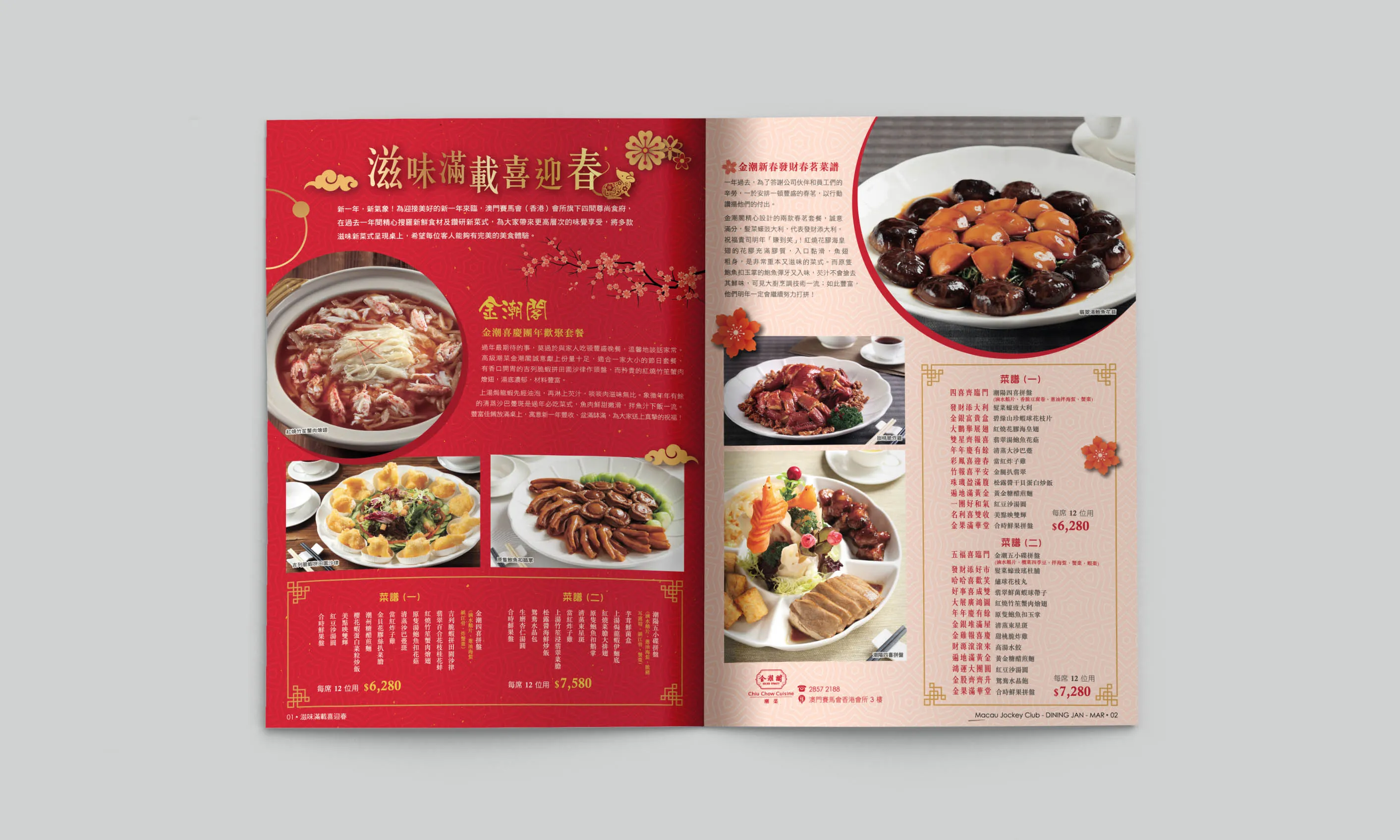
Each restaurant’s section opened with a title page, followed by feature dish spreads with professional food photography, succinct menu copy, and seasonal promotional highlights.
To reflect the premium nature of the restaurants and appeal to both Chinese and English-speaking audiences, the typographic choices included:
- Elegant serif fonts for headers and dish names
- Clean sans serif body text for descriptions and pricing
- Bilingual presentation, ensuring legibility and alignment in both Chinese and English without visual clutter
Each layout was carefully spaced, with ample white margins, modular grids, and image captions to support visual flow. Decorative lines, iconography, and background textures were subtly integrated to reinforce each restaurant’s identity while keeping the overall look uncluttered and refined.
The final printed brochure was produced in an A5 horizontal format, offering a balance between portability and page space. Print finishes included:
- High-gloss cover for visual appeal and durability
- Matte interior pages for readability and a smooth tactile feel
- Staple binding for simplicity and cost efficiency in quarterly production
The size and shape also made it ideal for countertop display, slip-in menu sleeves, or takeaway by customers.
The Dining Brochure played an important role in reinforcing the Macau Jockey Club’s positioning as a prestigious and culturally aware hospitality provider. It allowed returning guests to anticipate new seasonal offerings while giving first-time diners a curated snapshot of the breadth and quality available.
The use of consistent yet individually styled layouts for each restaurant helped preserve their unique identities while keeping the brand family visually united. This not only supported individual menu promotions but also subtly encouraged diners to explore the other restaurants in future visits.
Restaurant managers appreciated how the brochure helped streamline communication with guests, making it easier to present specials, recommend pairings, or answer guest enquiries without needing to rely solely on servers or verbal descriptions.
The Dining Brochure is a strong example of how multi-brand layout design can balance aesthetic harmony with clear differentiation. Through thoughtful structure, precise typography, and strategic colour use, it creates a smooth, elegant user experience that elevates everyday menu promotion into a refined brand narrative.
It proves that when print design is done right, it becomes more than just paper—it becomes a part of the dining journey.
