Drama Playscript Book
Design has the power not only to communicate but to transform, to connect individuals across divides, and to give voice to those often unheard. The Drama Playscript Book, published in 2014 by the Lay Prison Evangelical Organization, stands as a moving testament to these values. Developed under the Rehabilitation Pioneer Project (RPP) and supported by the Hong Kong Correctional Services Department, this publication was created not simply as a record of dramatic works, but as a meaningful communication tool for rehabilitation, reflection, and youth education.
The Rehabilitation Pioneer Project was launched in 2008 with the aim of instilling positive values in secondary school students and young people in Hong Kong. Through a combination of school talks, outreach, and experiential activities, RPP seeks to promote law-abiding, drug-free lifestyles, while educating the public about offender rehabilitation.
One of the most powerful and long-standing components of RPP is the annual drama performance titled “Creation and Rehabilitation”, staged inside Stanley Prison. Each year, persons-in-custody (PICs) write and perform original plays and music, sharing their stories, regrets, and aspirations directly with visiting students and educators. These performances are incredibly moving, as they offer raw and authentic insights into personal transformation and second chances.
The Drama Playscript Book was designed to document and preserve the creative output of these performances, consolidating 12 original drama scripts written by PICs, along with song lyrics, illustrations, volunteer reflections, and photographic highlights from the drama events. It is not just a book. It is a bridge between worlds, connecting incarcerated individuals with the community through empathy and expression.
The design challenge was to create a visual and structural format that honoured the depth and dignity of the contributors while remaining accessible to young readers and educators.
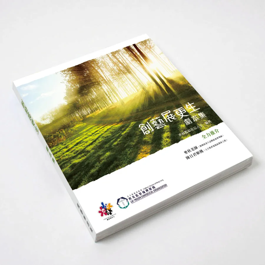
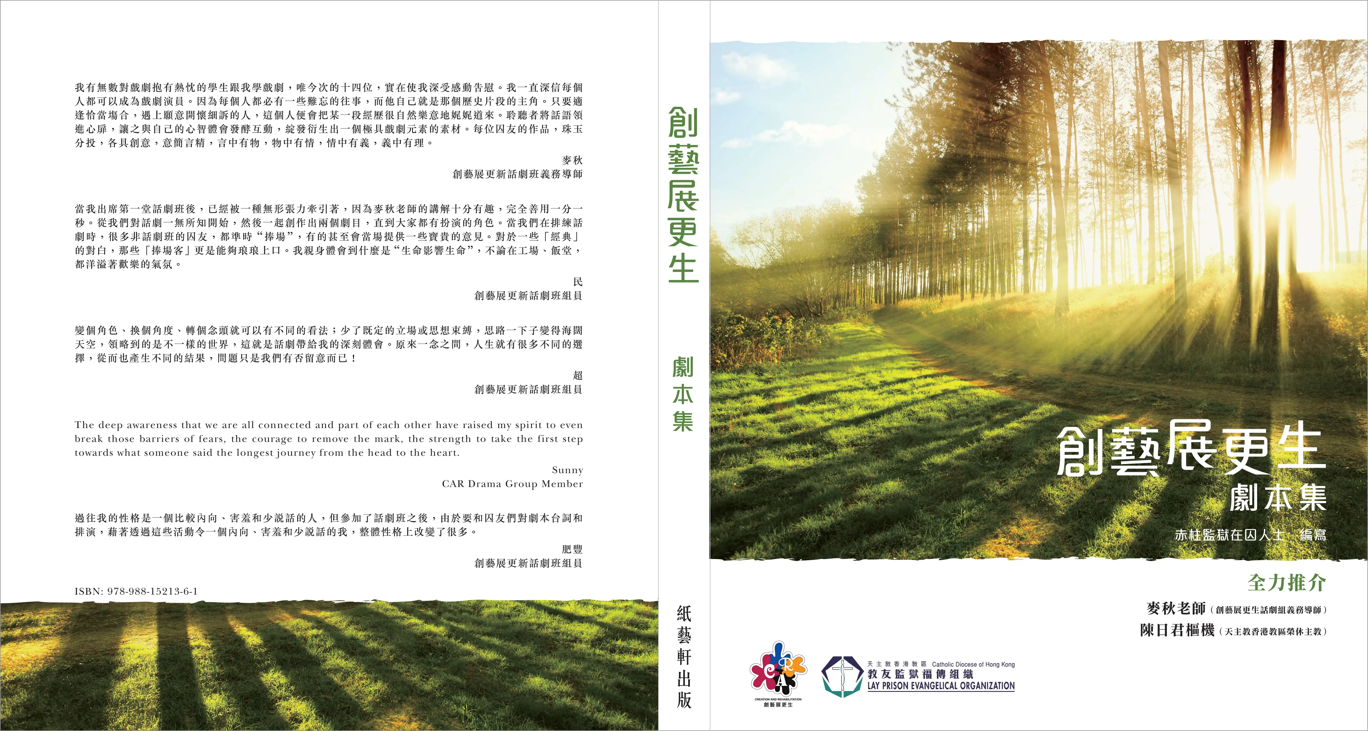
The cover design is grounded in powerful metaphor. We used a photograph of sunlight filtering through a dense forest, a visual representation of hope, growth, and the possibility of transformation. The forest, with its overlapping vertical trunks, evokes a visual parallel to prison bars, symbolising the constraints and environment the PICs inhabit. Yet the sunlight piercing through suggests optimism, rebirth, and the enduring human capacity for change.
This cover image is purposefully minimal and reflective, inviting the reader to pause and consider the journey within. A subdued title treatment, in white over the darkened photo, adds to the tone of quiet strength and purpose.
The internal pages were printed in black and white to maintain cost-effectiveness while reflecting the raw, journal-like nature of the content. Rather than using full-colour imagery, we focused on typographic structure, symbolic visual elements, and layout rhythm to differentiate between sections and aid readability.
Key design considerations included:
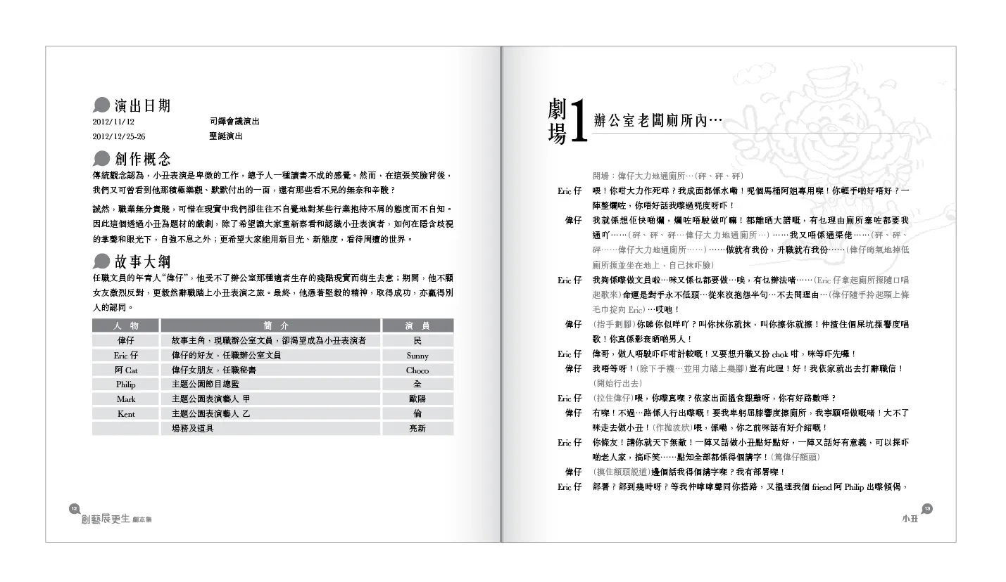
- Clear section headers to distinguish each drama script, paired with inspirational quotes or contextual summaries.
- Song lyrics and dialogues typeset in script-like formatting to capture the energy of performance while maintaining legibility.
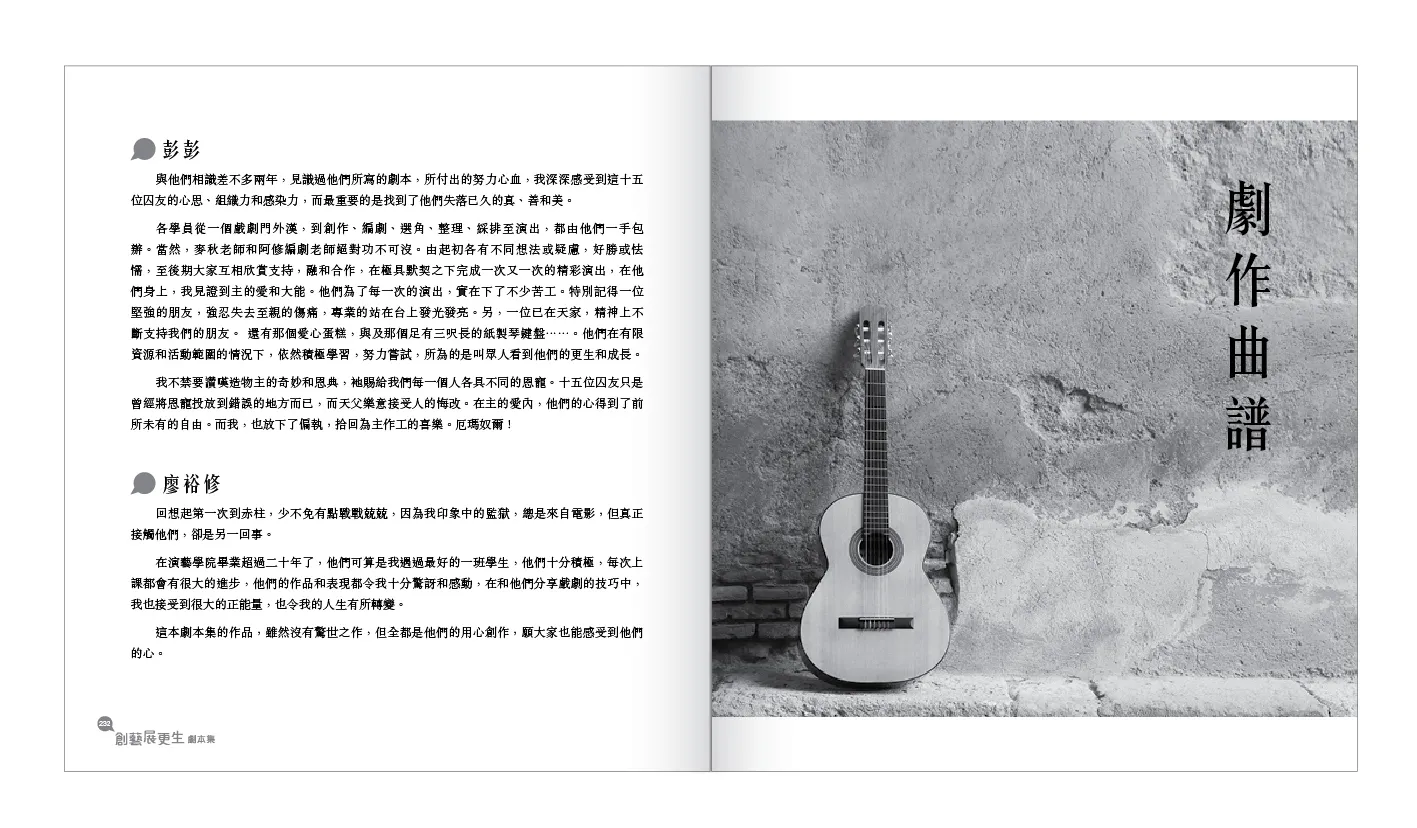
- Volunteer reflections and commentary sections were styled as pull quotes or inset blocks to create pauses within the narrative and encourage deeper engagement.
- Hand-drawn illustrations and sketches contributed by PICs were used sparingly and respectfully, providing glimpses into the visual imagination of the contributors without overwhelming the textual content.
- Symbolic icons and line dividers (such as broken chains, rays of light, or budding leaves) were introduced between chapters to reinforce the themes of freedom, hope, and growth.
Typography was chosen with accessibility in mind, a sans serif body font for readability, paired with a more expressive display font for section titles and quotes. We used font size variation and bold contrasts to emphasise key messages and make the dense content more inviting, especially for student readers.
The book is structured to encourage chronological and thematic reading, starting with a foreword from the organisation, followed by the drama scripts, interspersed with:
- Reflections from volunteers and correctional staff
- Visual highlights from the performances
- Lyrics to original music composed and performed by PICs
- A closing message on rehabilitation and reintegration
This editorial flow reinforces the journey from brokenness to healing, from confinement to creativity.
The publication was distributed during school visits, drama performances, and RPP seminars. It served as an educational tool for secondary schools, providing students with a tangible way to engage with the stories they had heard on stage. Teachers praised the book for its authenticity and emotional depth, while volunteers and correctional officers recognised its role in capturing the often-ephemeral impact of the performance series.
Above all, the book gave the persons-in-custody a sense of dignity, their voices preserved, their words printed, their journeys shared.
The Drama Playscript Book is a rare example of how design and publishing can amplify marginalised voices, contribute to social rehabilitation, and offer meaningful connection across communities. Through careful symbolism, respectful layout, and thoughtful structure, this project stands not only as a publication but as an act of design for humanity.
