GoodSOGood
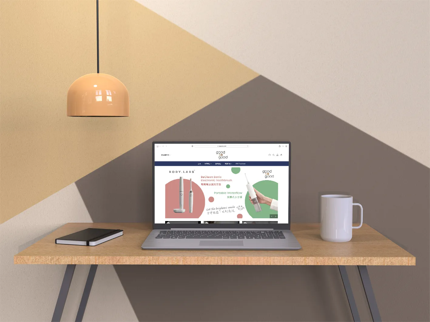
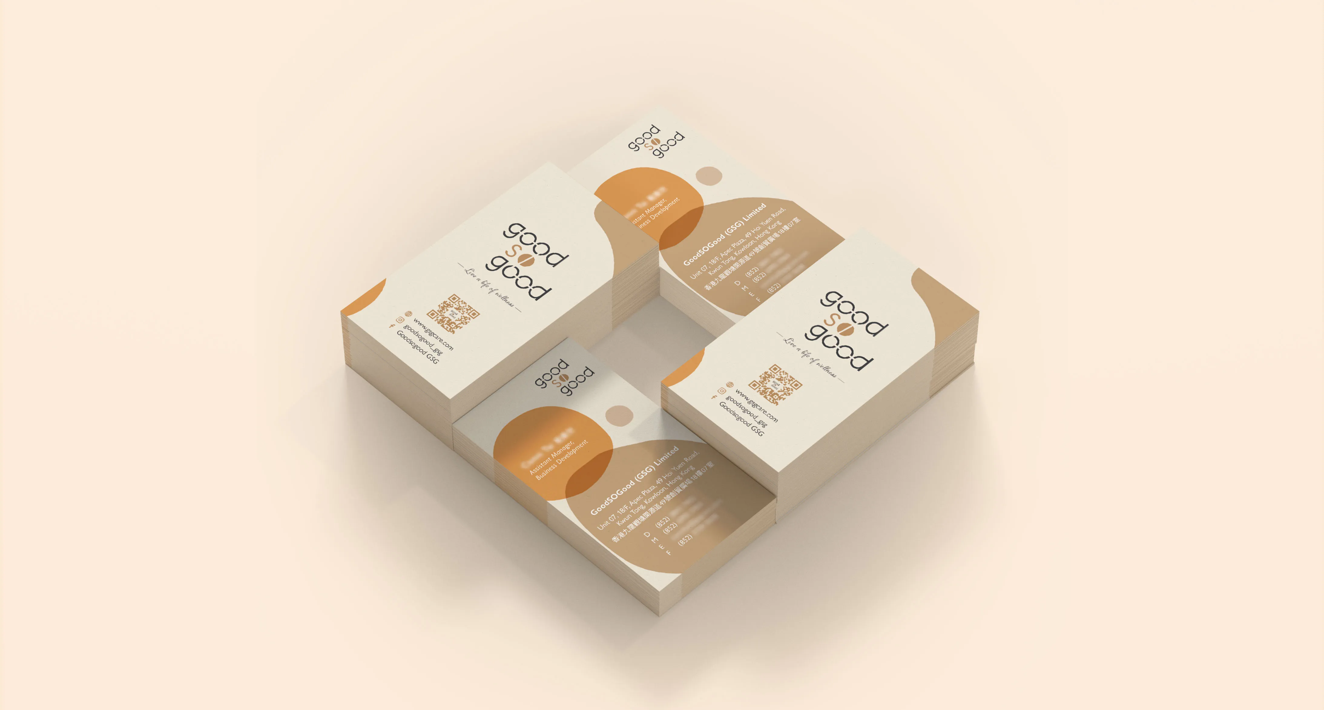
GoodSOGood is a trading company that connects customers with high-quality lifestyle products, from food ingredients to wellness items. Targeting consumers who value health, comfort, and style, the brand needed a visual identity that conveys trust, energy, and elegance. The identity design covered the logo, business card, and website, all aligned to communicate a premium yet approachable feel.
The client specifically requested a clean and fresh look, avoiding anything overly traditional. A sans serif font was chosen to express modernity and friendliness, while a distinctive line joins several “O”s in the logo to symbolise the company’s global reach—linking continents and cultures through quality products.
The colour palette of dark grey and beige was selected to balance professionalism with warmth, creating a calm and confident visual presence. These colours were applied consistently across the stationery and web interface, reinforcing the brand’s image.
The final result reflects GoodSOGood’s values and market positioning—stylish, trustworthy, and globally connected—through a brand identity system that is both meaningful and visually impactful.
