Paperlove Magazine
In an age of fast digital scrolling, printed magazines offer a unique opportunity to slow down, immerse, and connect with curated experiences. With that spirit, Paperlove Magazine was developed as an annual lifestyle and product showcase for Paperhouse Creations, a brand known for its creative stationery products including desk calendars, calendar cards, red packets, and seasonal paper goods.
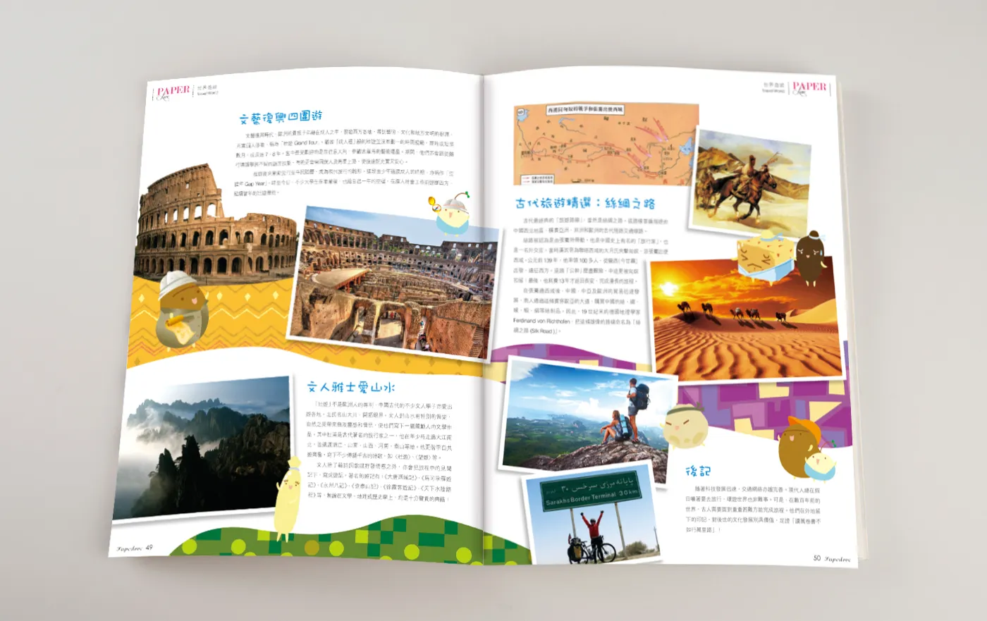
More than a product catalogue, Paperlove Magazine was designed as a branded lifestyle publication, blending promotional content with thematic storytelling. Each year, the magazine’s visual language and editorial content revolved around the central theme of the company’s product line. For the 2015 issue, the chosen theme was “Travel”, a concept that evokes curiosity, reflection, exploration, and personal growth.
The magazine served dual purposes:
- Introduce and visually promote the company’s seasonal product collection, including calendars and gifting items for the coming year
- Enrich the customer experience through themed editorial articles, tying everyday paper products to broader lifestyle inspirations
For customers browsing the brand at retail shops, stationery expos, or direct mail, the magazine became both a lookbook and reading piece, a tangible expression of the brand’s values and seasonal story.
The content was structured around three main sections:
- Product Feature Pages – introducing the new collection in styled layouts
- Editorial Articles – offering engaging, travel-themed content
- Customer Interaction Pages – including tips, personal stories, and call-to-action invitations to explore or share
With “Travel” as the overarching theme, the visual design of the 2015 issue drew heavily from:
- Vintage travel aesthetics (e.g. postcards, passport stamps, train tickets)
- Contemporary minimalist layout for balance and modern appeal
- Soft pastel tones and warm neutrals to convey comfort, serenity, and nostalgia
The cover featured a hand-illustrated travel map motif with dotted-line routes, tiny icons of planes, cameras, and landmarks, and the magazine title overlaid in a script font that resembled handwritten journaling.
Each internal spread was crafted with careful attention to typographic hierarchy, image-to-text balance, and modular grid layout, offering both browsing ease and visual charm.
Product pages featured:
- High-resolution flat lay photography of calendar designs, red packets, and desktop items
- Lifestyle context shots, such as a travel calendar beside a suitcase or a red pocket placed in a travel diary
- Specifications and purchasing info, elegantly laid out with visual symbols for size, paper type, packaging, and usage occasion
Short descriptions accompanied each product, maintaining a friendly, concise tone that suited the leisurely reading style of the magazine.
To extend the travel theme beyond visuals, the magazine included a series of short articles, designed to feel like pages from a modern travel journal. These stories connected to both the product theme and the readers’ own travel dreams.
Sample article topics included:
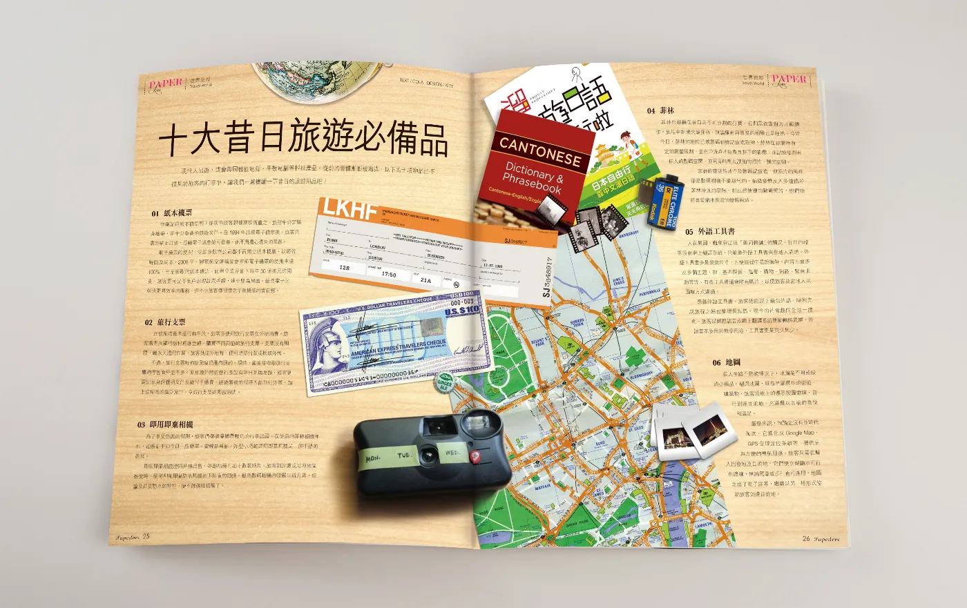
- “Travel Then & Now” – a visual comparison of how travel styles, luggage, and communication have evolved over time
- “Essentials in Your Travel Bag” – featuring practical tips and suggestions for a beautifully packed trip, with Paperhouse products woven into the mix
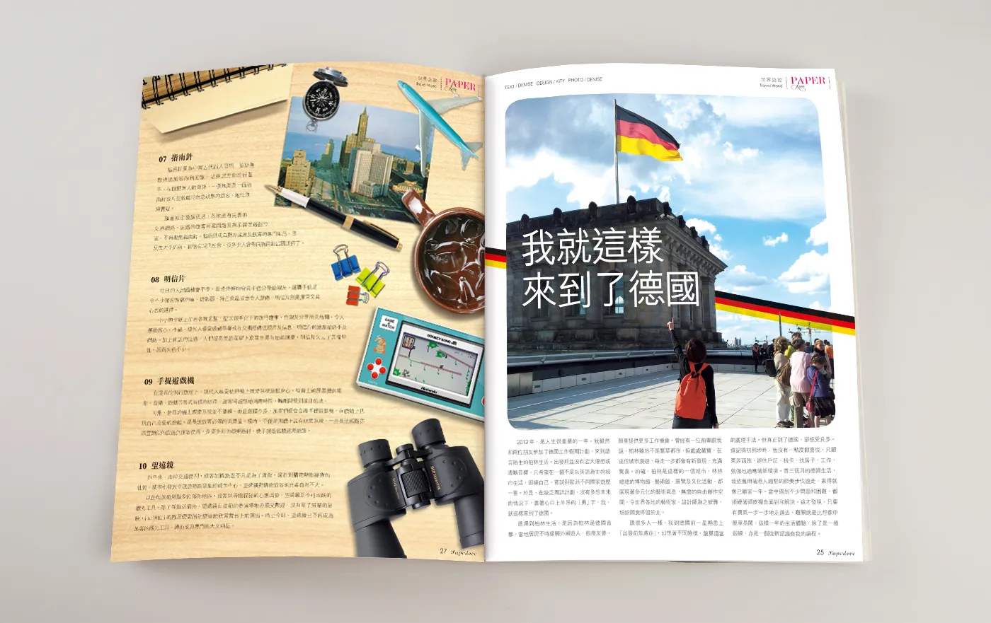
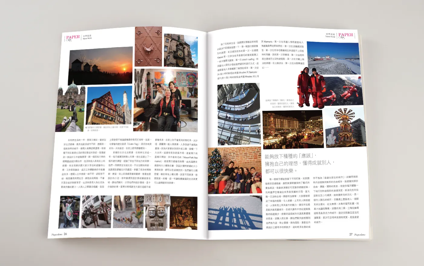
- “Working Holiday Stories” – real-life reflections from young travellers who spent time abroad, captured in first-person writing with accompanying photo collages
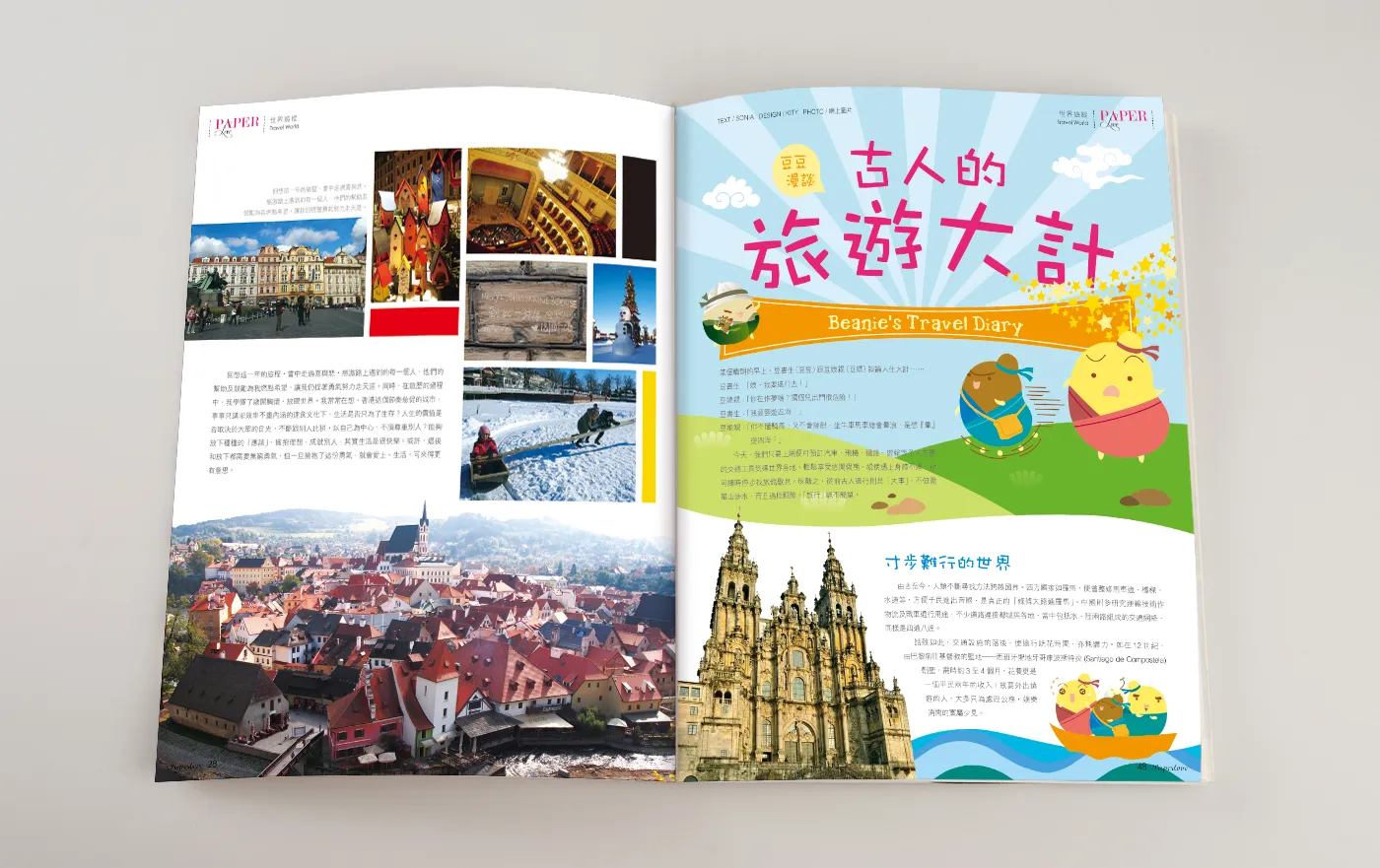
- “The Power of a Paper Map” – a nostalgic piece about the role of printed maps and journals in personal travel adventures
Each article was styled with graphic elements such as pins, paper clips, ticket stubs, or handwritten notes, further enhancing the tactile storytelling.
- Paper: Matte finish with soft-touch cover, adding tactile warmth and durability
- Print Quality: High-resolution CMYK throughout, with subtle use of spot colour and texture overlays to mimic worn travel materials
The magazine was distributed alongside gift sets, within selected retail shops, and at stationery exhibitions, where it became a talking point and takeaway that customers held onto long after browsing.
Paperlove Magazine successfully elevated the brand’s positioning from a seasonal product seller to a lifestyle and experience brand. Readers appreciated the editorial tone, travel inspiration, and thoughtful product integration. Many customers described it as a “collectable,” keeping it as a reference or re-reading it for travel motivation.
It also reinforced Paperhouse Creations’ identity as a brand that values storytelling, sentiment, and everyday beauty, an essential combination for the stationery and gifting market.
The Paperlove Magazine project demonstrates how publication design can bridge commercial intent with editorial richness, transforming a product catalogue into a meaningful reader experience. Through cohesive storytelling, aesthetic refinement, and purposeful layout, the magazine became a platform that not only showcased products but inspired journeys, both real and imagined.
