Restaurant Poster Display

In the highly competitive and visually rich world of food and beverage marketing, a well-crafted poster does more than advertise a dish – it sets the mood, whets the appetite, and draws diners into an experience. This was the guiding principle behind the restaurant poster display project designed for four club-level restaurants under the Macau Jockey Club: Golden Restaurant, Golden Dynasty, Yo Ro Ko Bu Japanese Restaurant, and Full Moon Shanghai Restaurant.
Each of these restaurants serves a unique cuisine and clientele, but they share a common objective: to engage diners through seasonal and festive promotions that align with both culinary offerings and cultural calendars. Our design role was to create visually compelling poster artwork that rotated quarterly, highlighting key dishes, limited-time menus, and thematic promotions tailored to specific holidays or seasonal ingredients.
The Macau Jockey Club is not only a well-established racing organisation but also a provider of exclusive clubhouse dining experiences. The four restaurants involved in this project reflect diverse culinary themes:
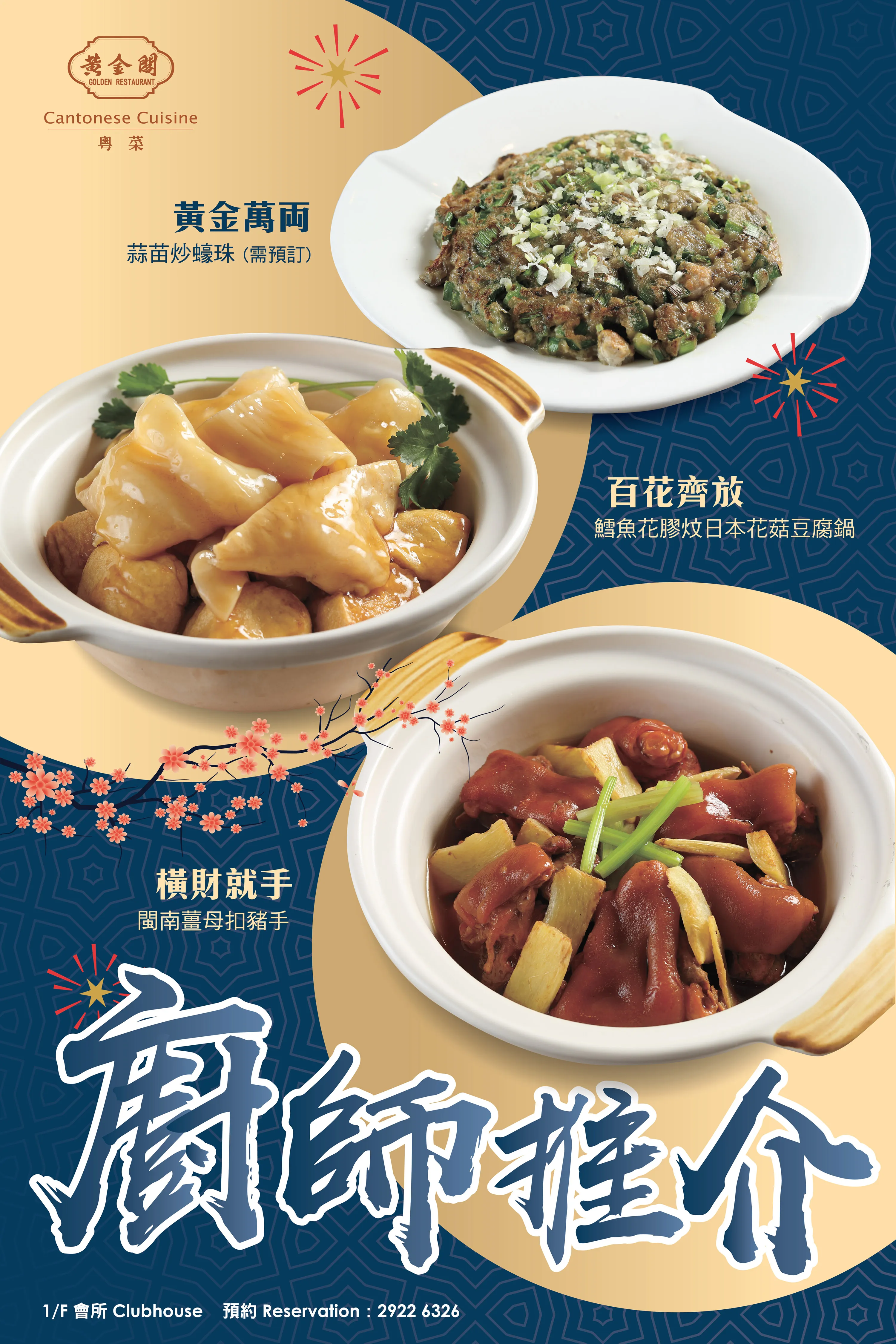
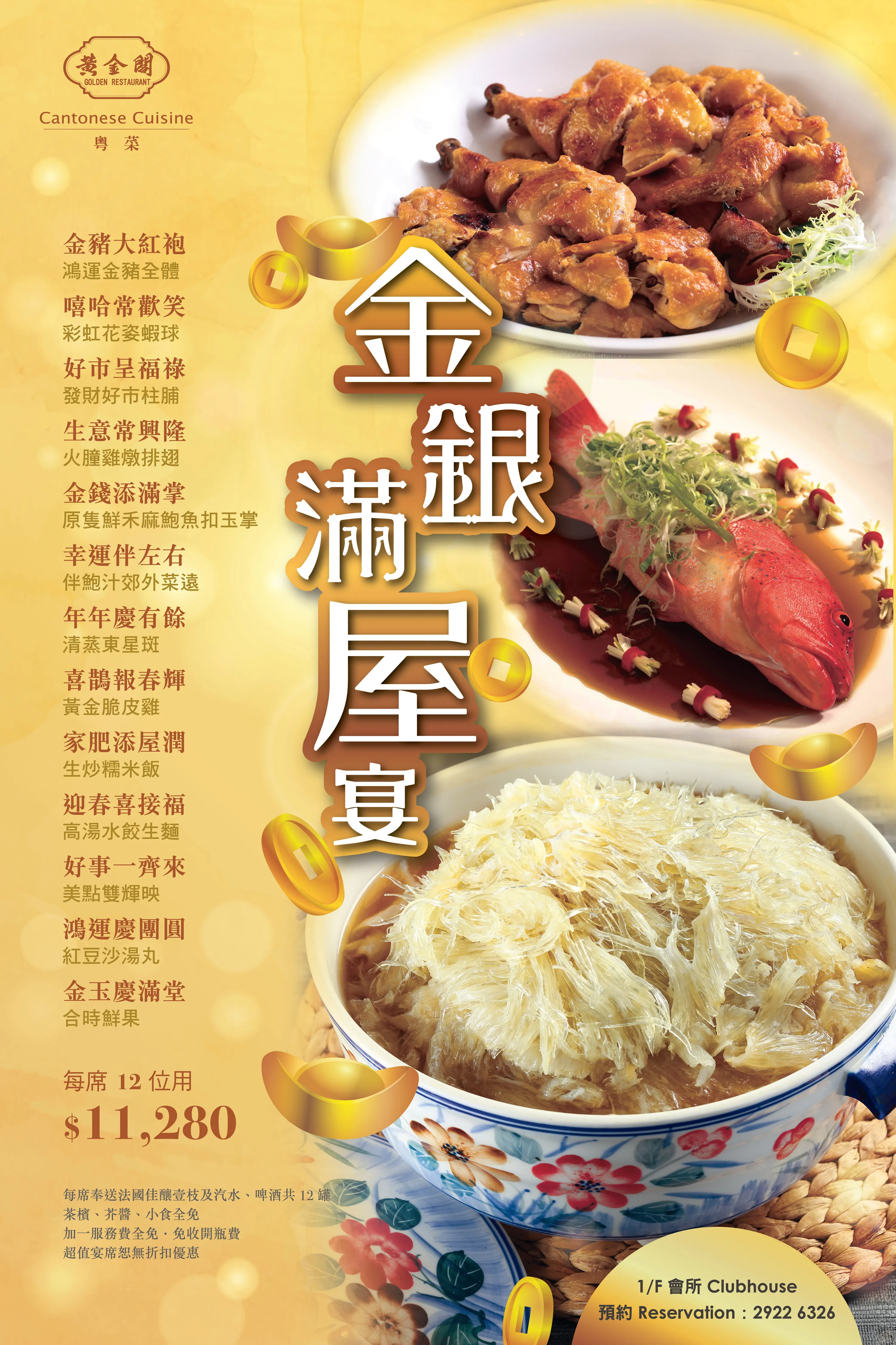
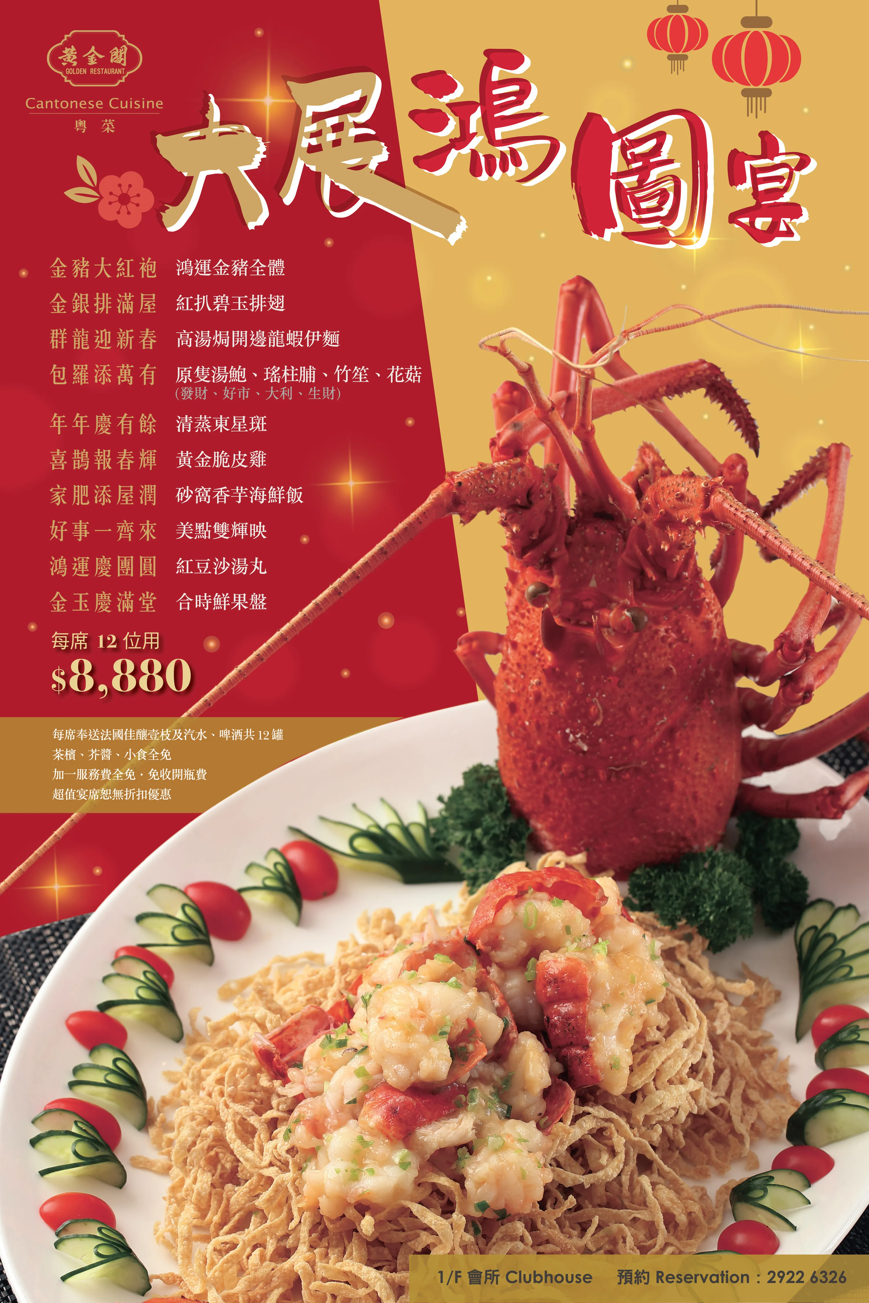
- Golden Restaurant: Focused on contemporary Cantonese cuisine
- Golden Dynasty: A more premium take on traditional Chinese banquet fare
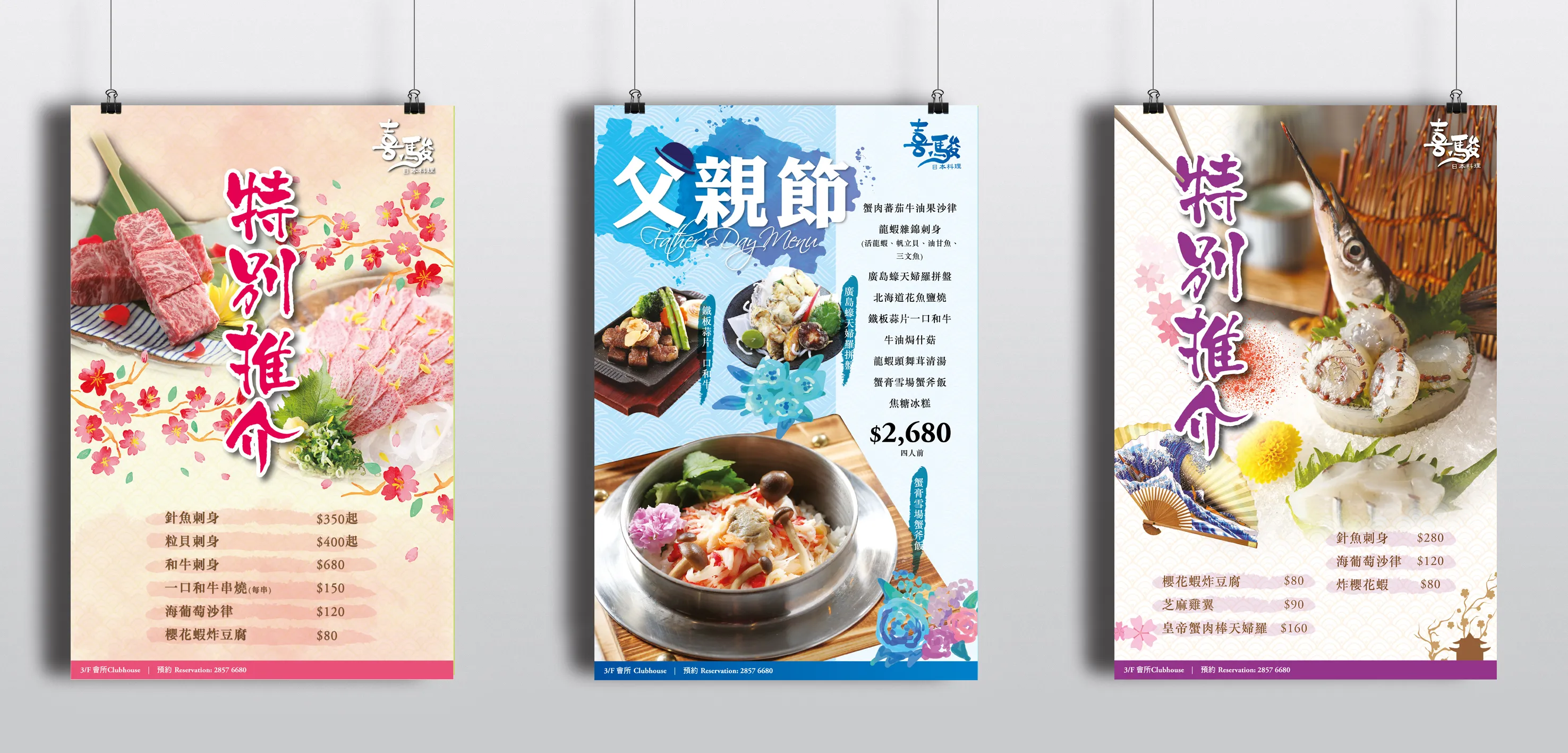
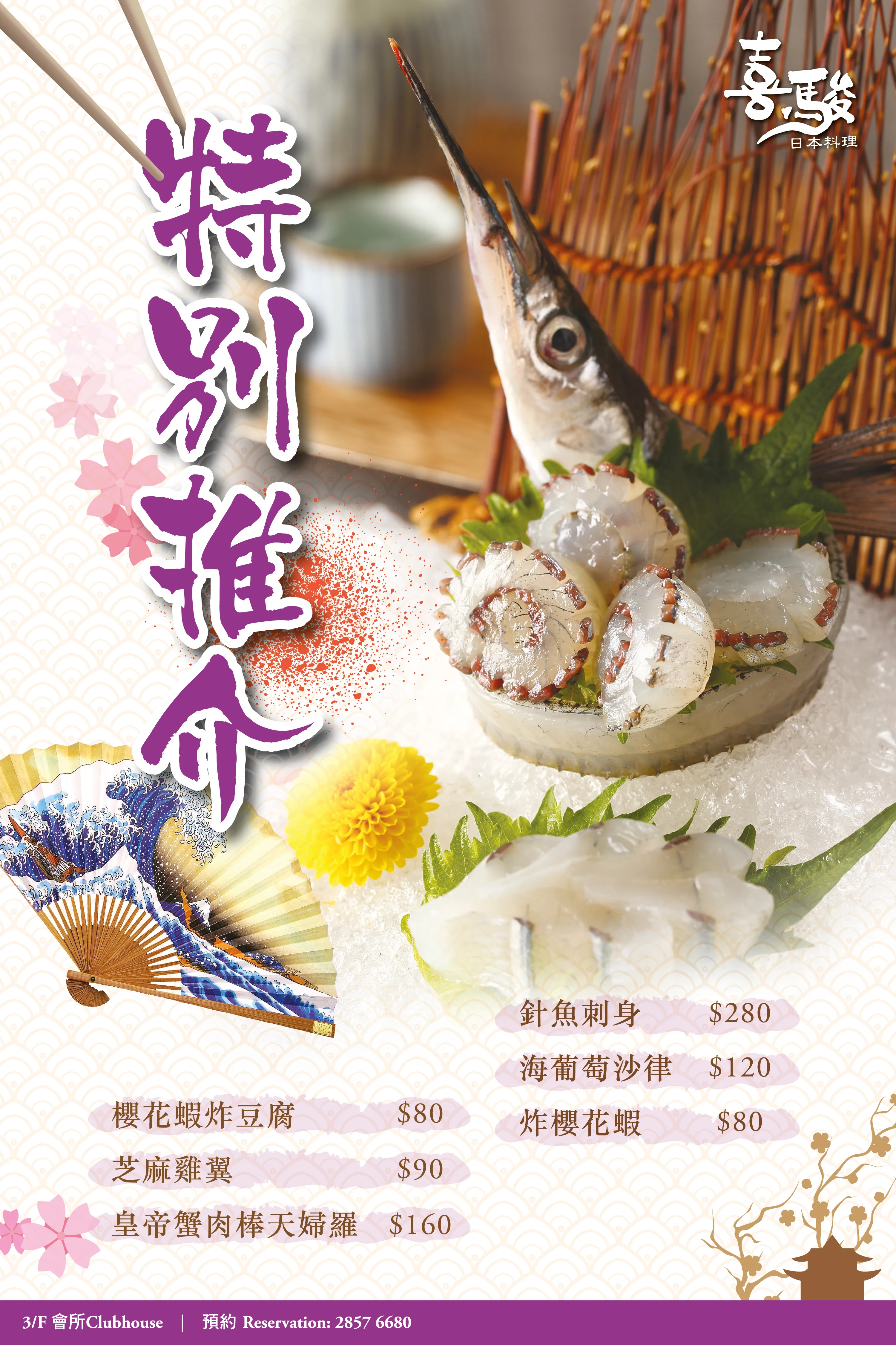
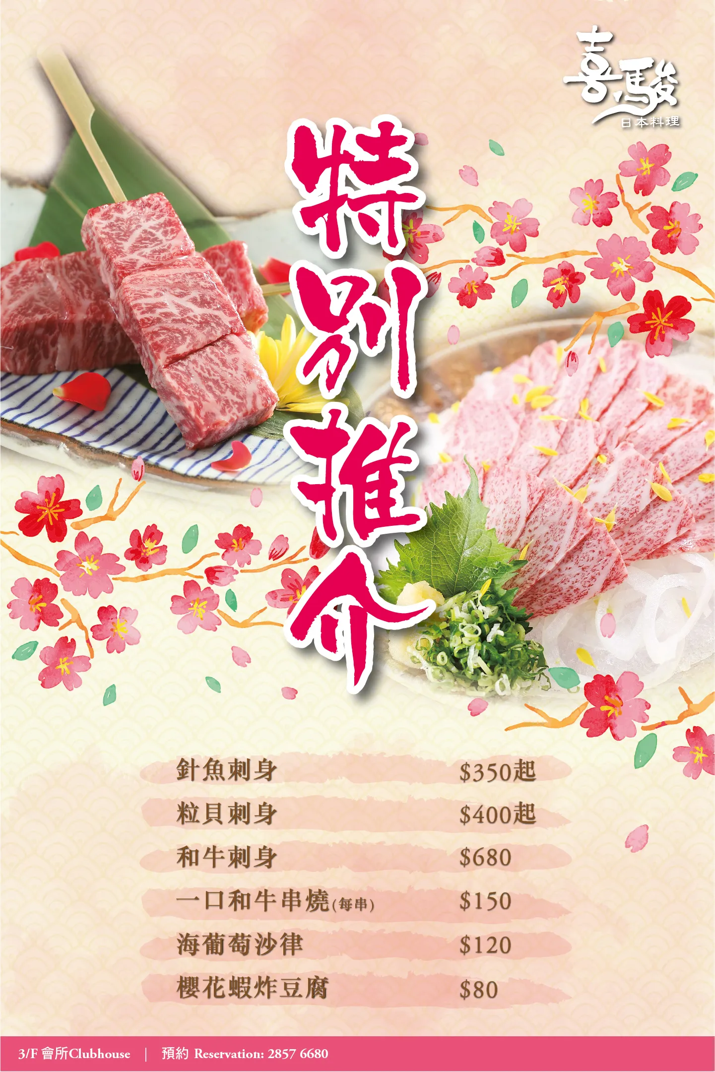
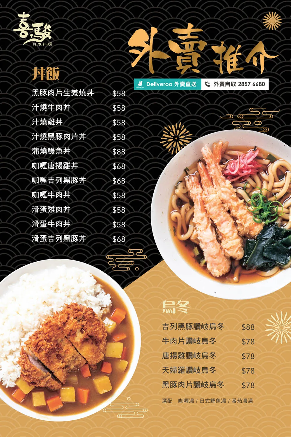
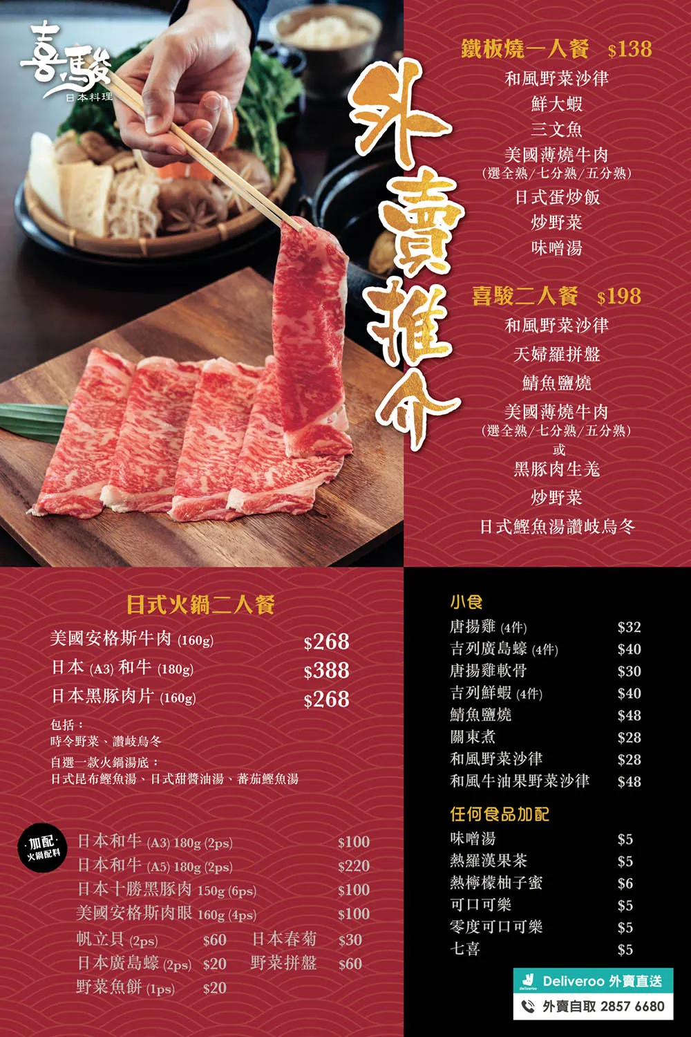
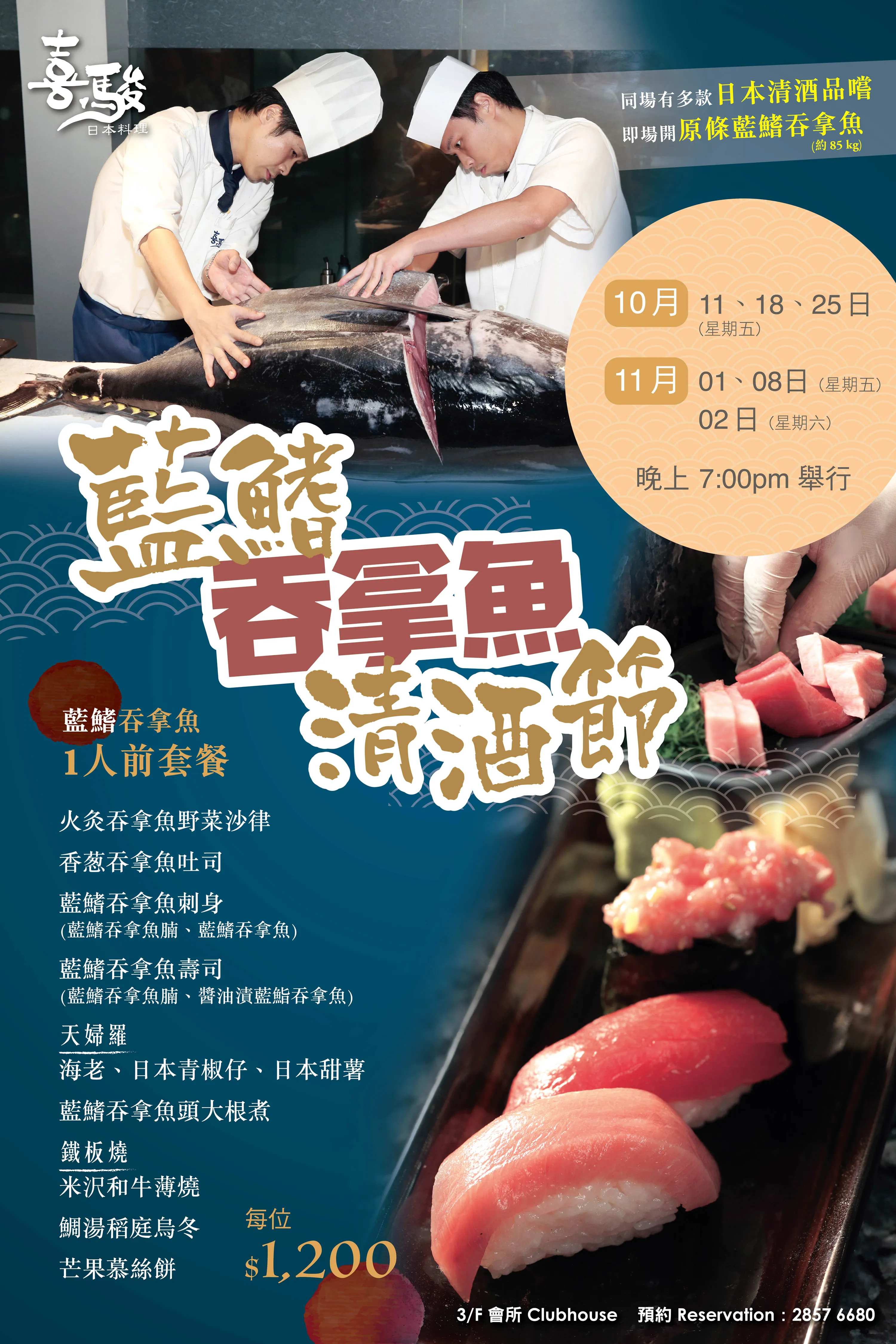
- Yo Ro Ko Bu: A Japanese restaurant offering fresh seasonal sets and traditional plates
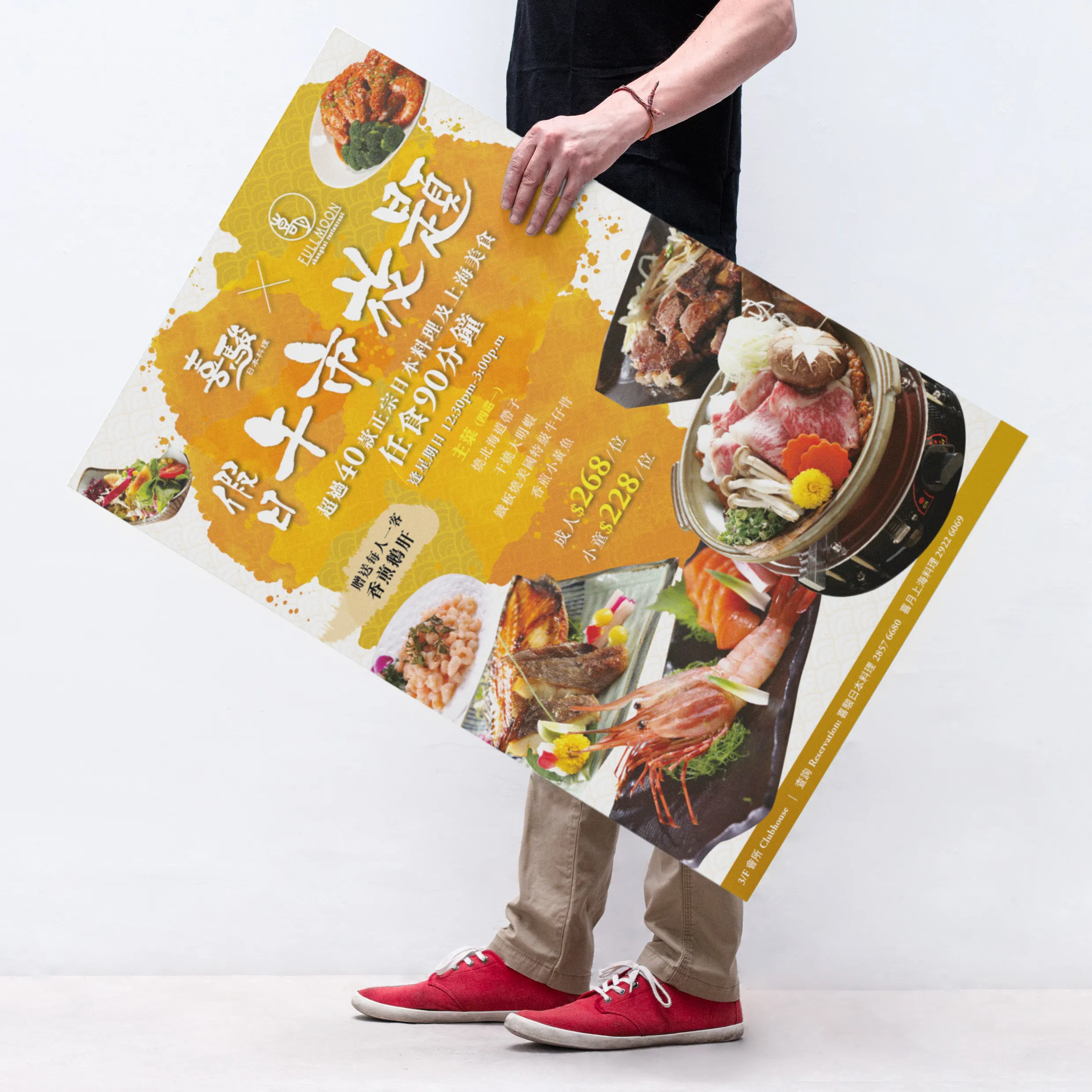
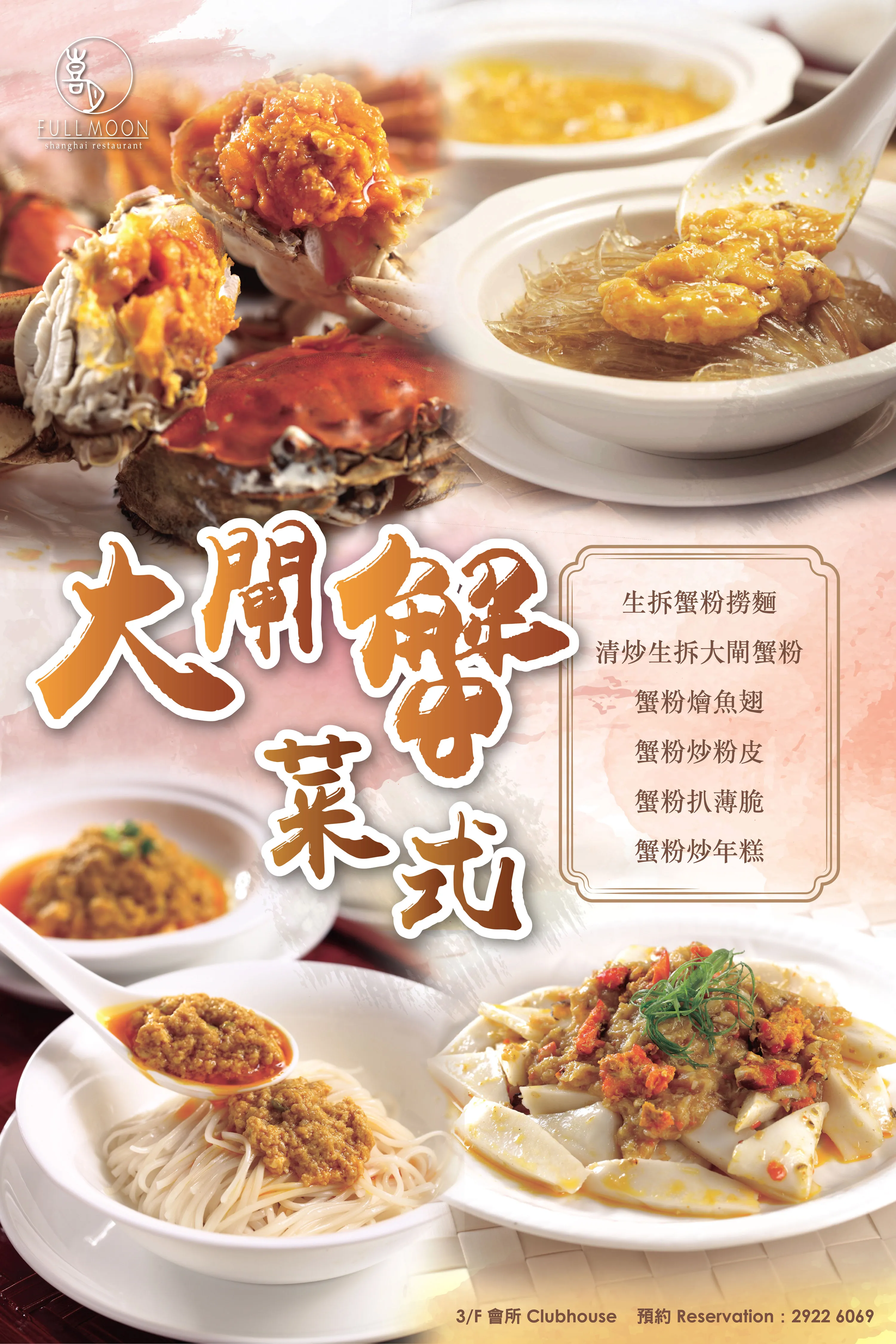
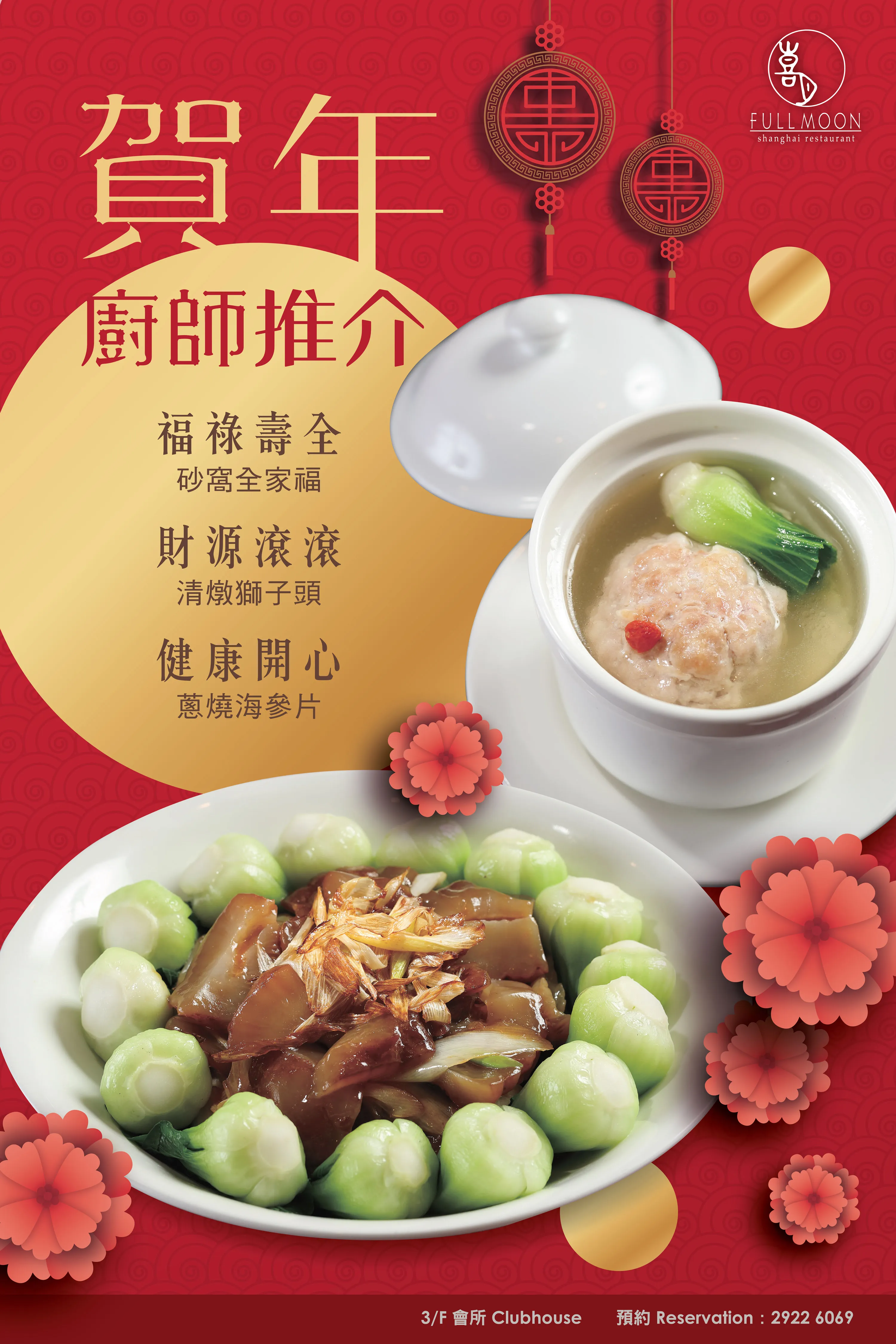
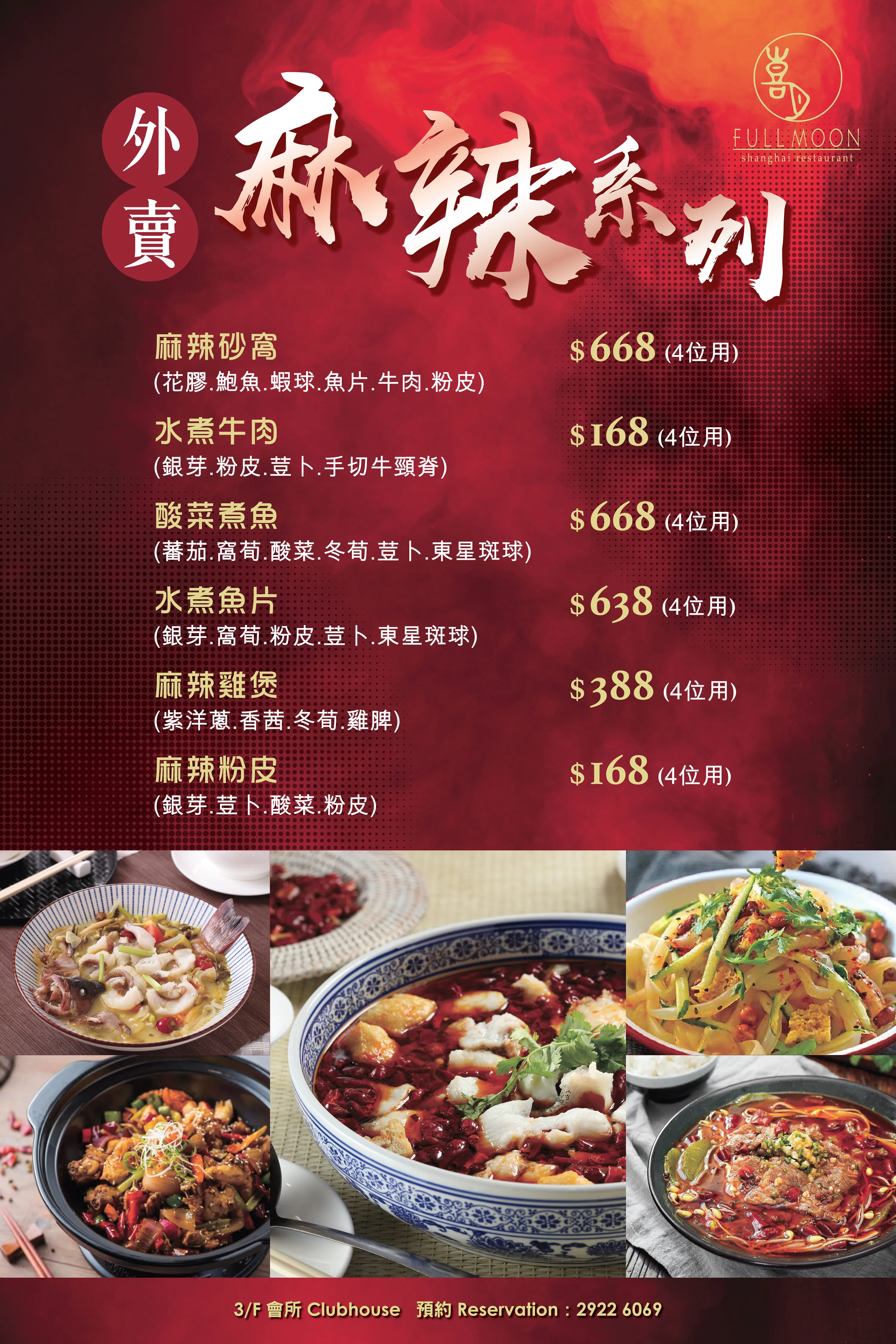
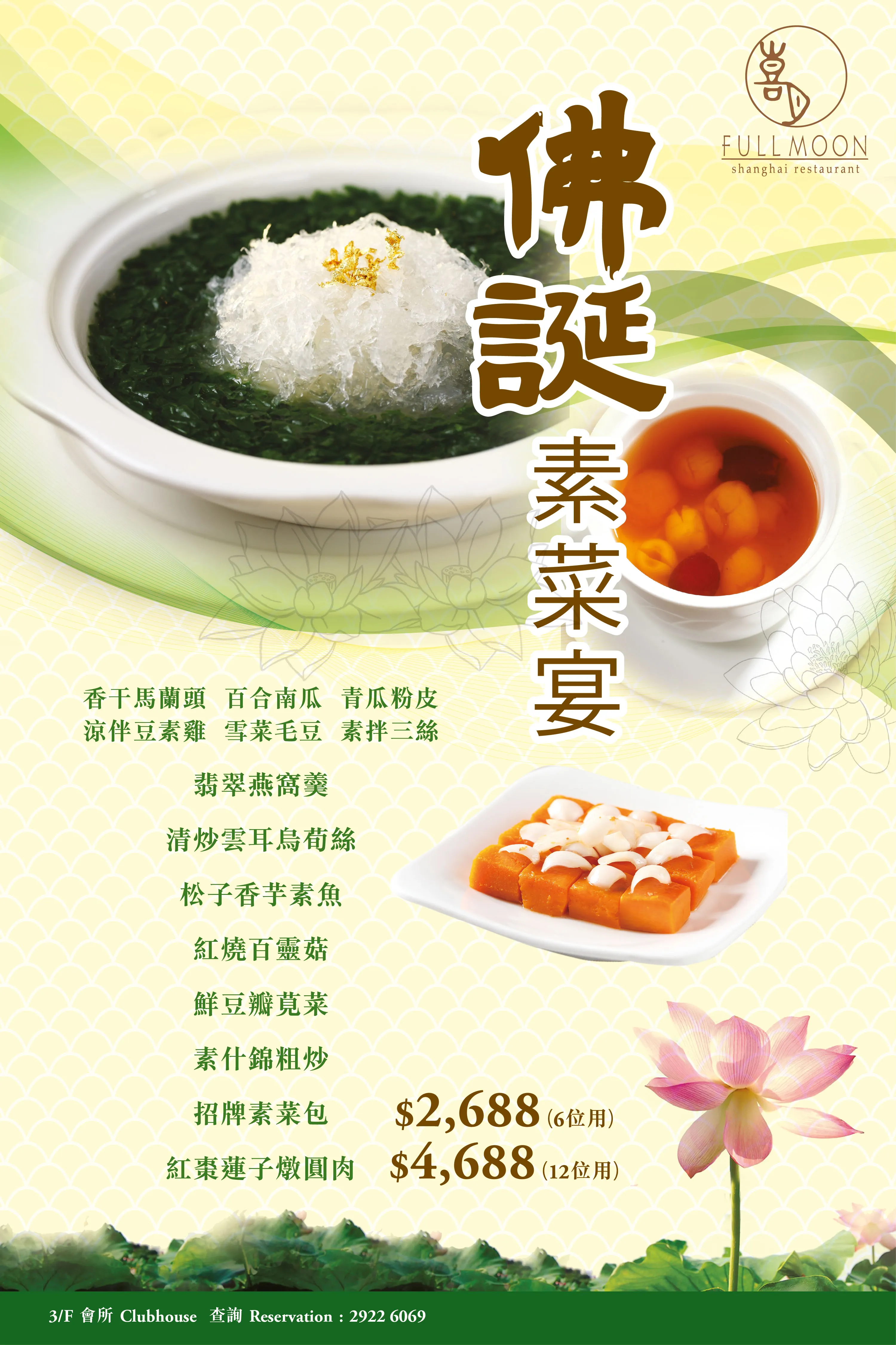
- Full Moon Shanghai Restaurant: Specialises in Shanghainese delicacies and regional Eastern Chinese dishes
While each venue had its own brand identity and dining concept, our task was to develop a cohesive design system that could be easily adapted to different culinary themes while maintaining high visual standards appropriate for a members-only environment.
The posters served as the primary in-house advertising tools and were displayed at key customer touchpoints, such as:
- Lobby entrances
- Restaurant waiting areas
- Inside elevator panels
- Near lift lobbies and reception desks
The objective was to quickly capture attention, convey the seasonal or promotional theme, and entice customers to dine, book, or inquire further.
Design strategy was shaped by the following key requirements:
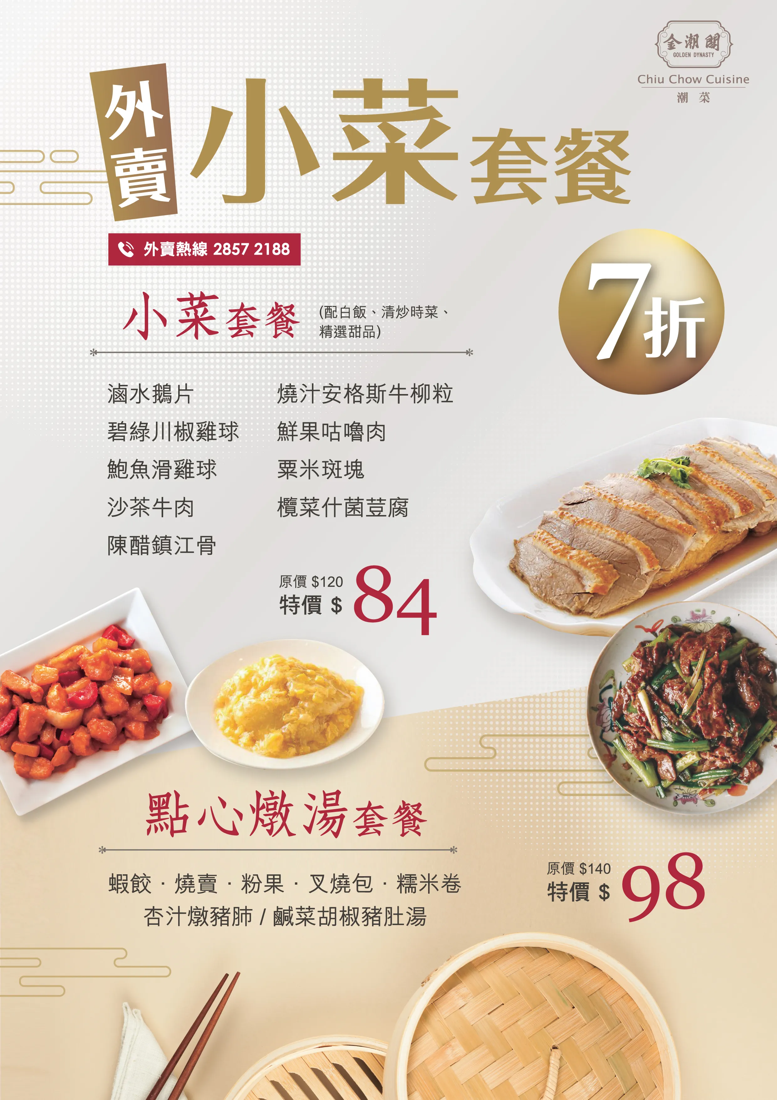
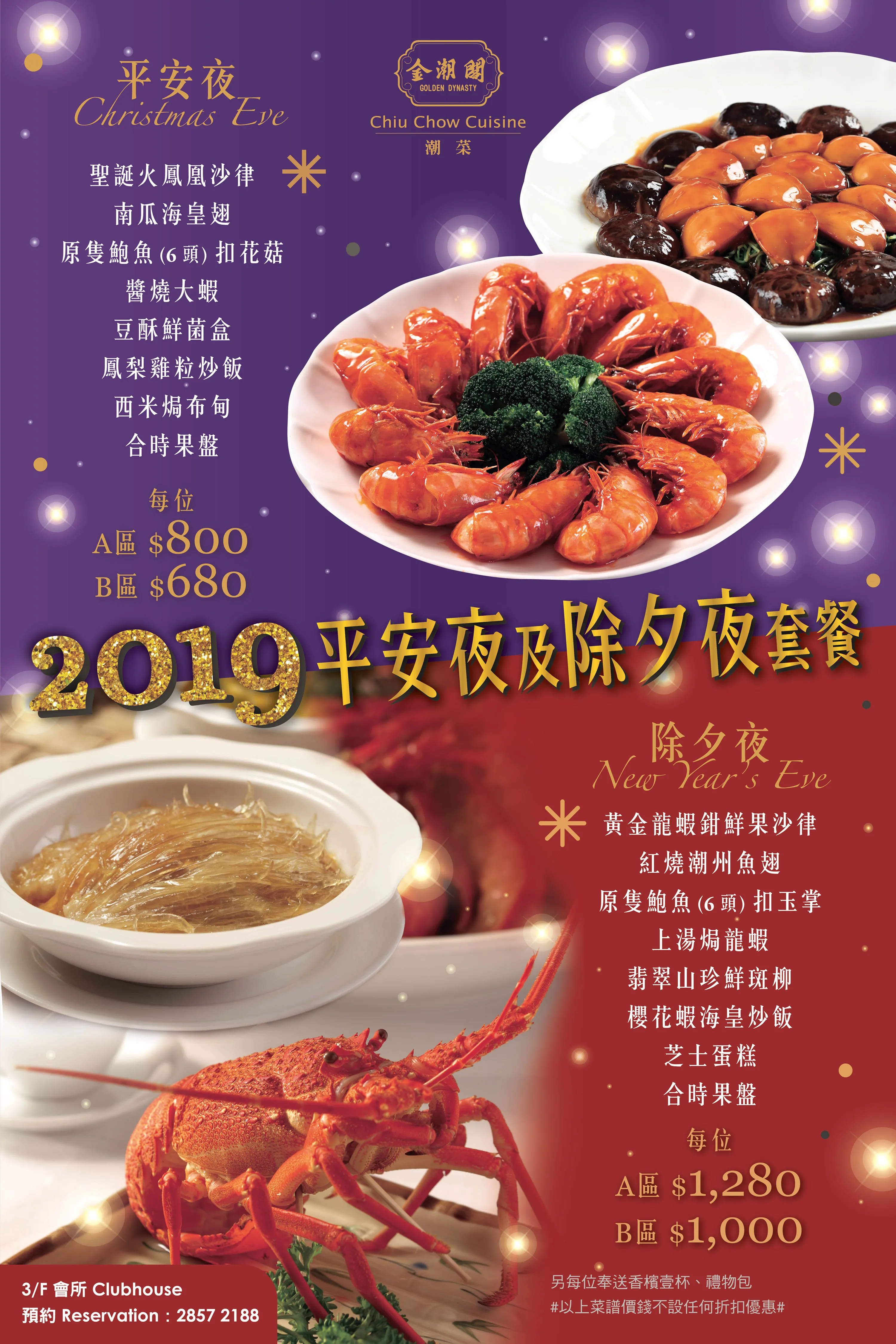
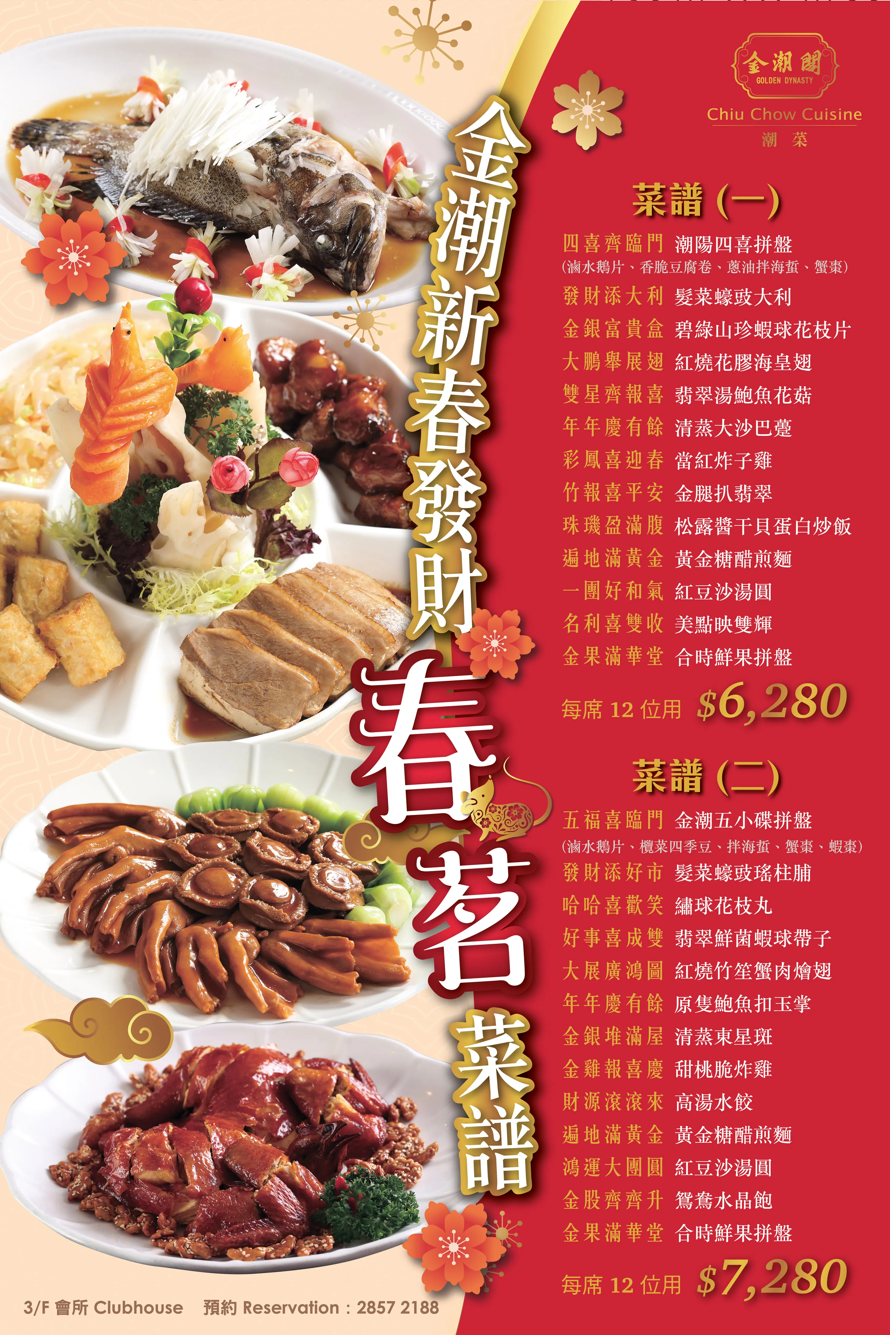
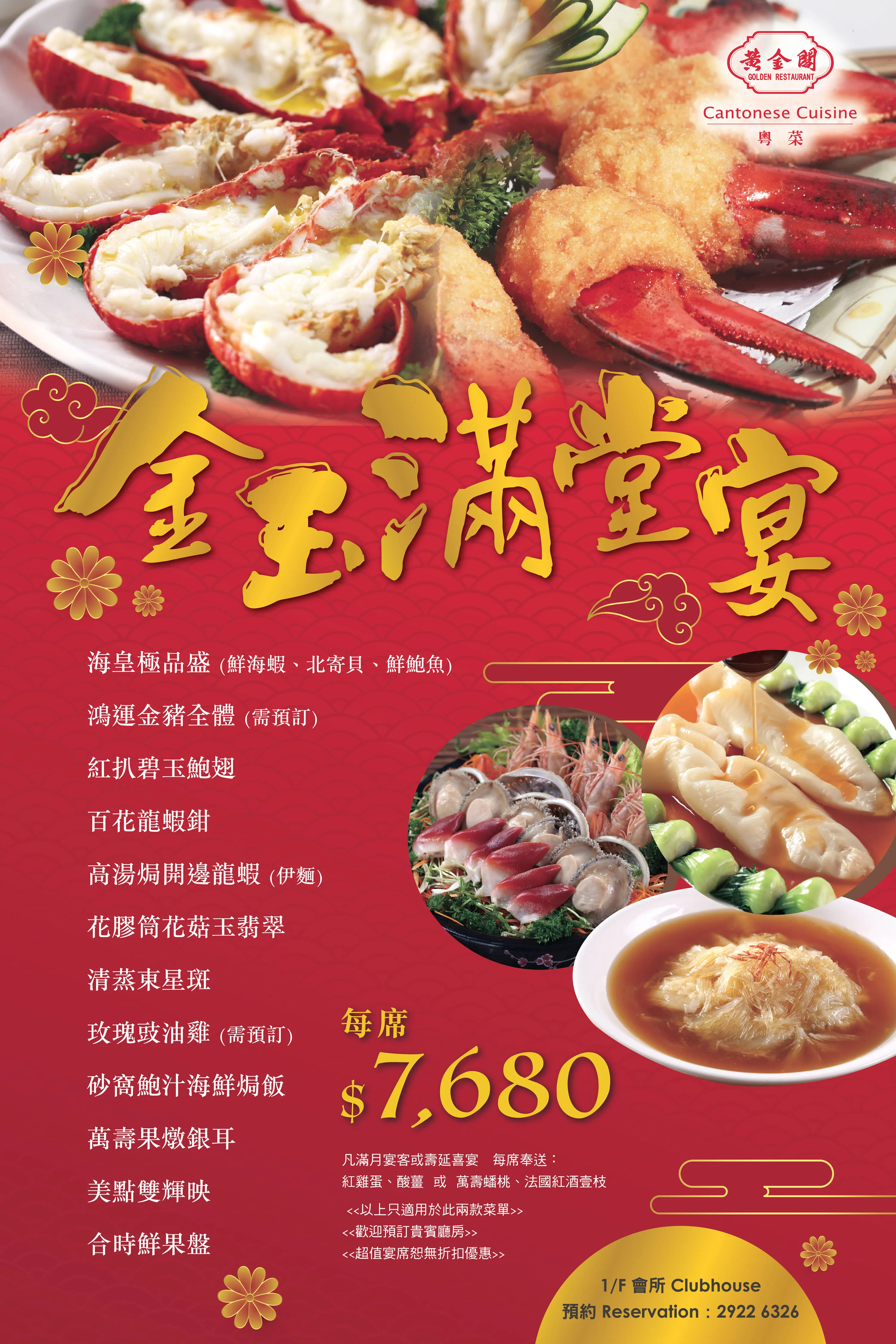
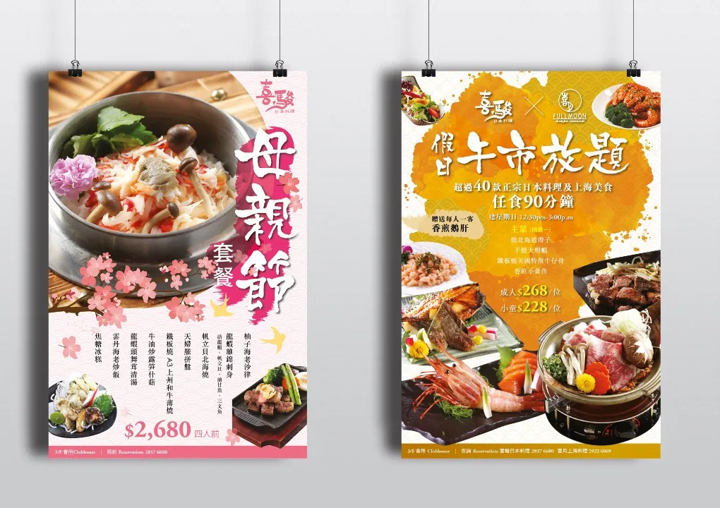
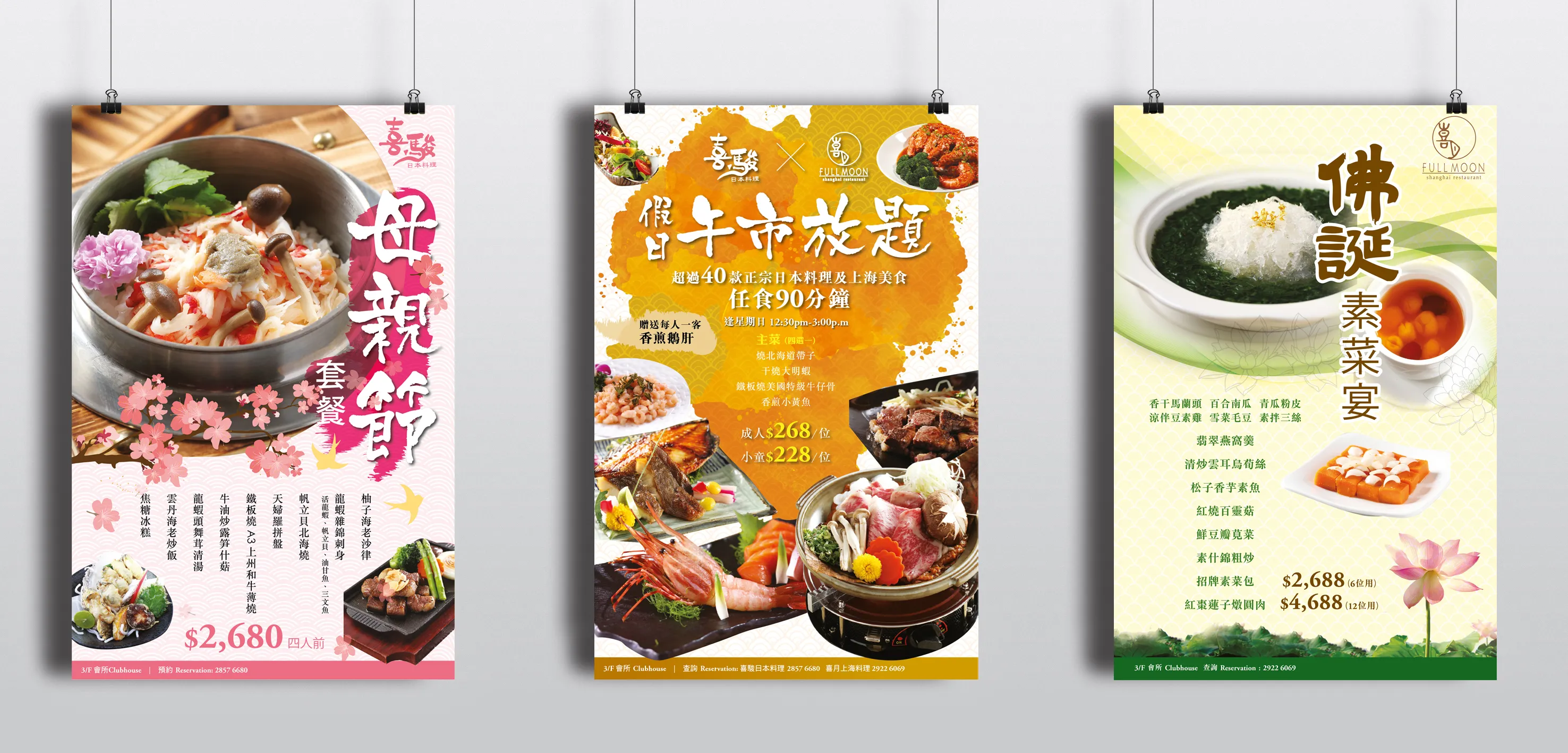
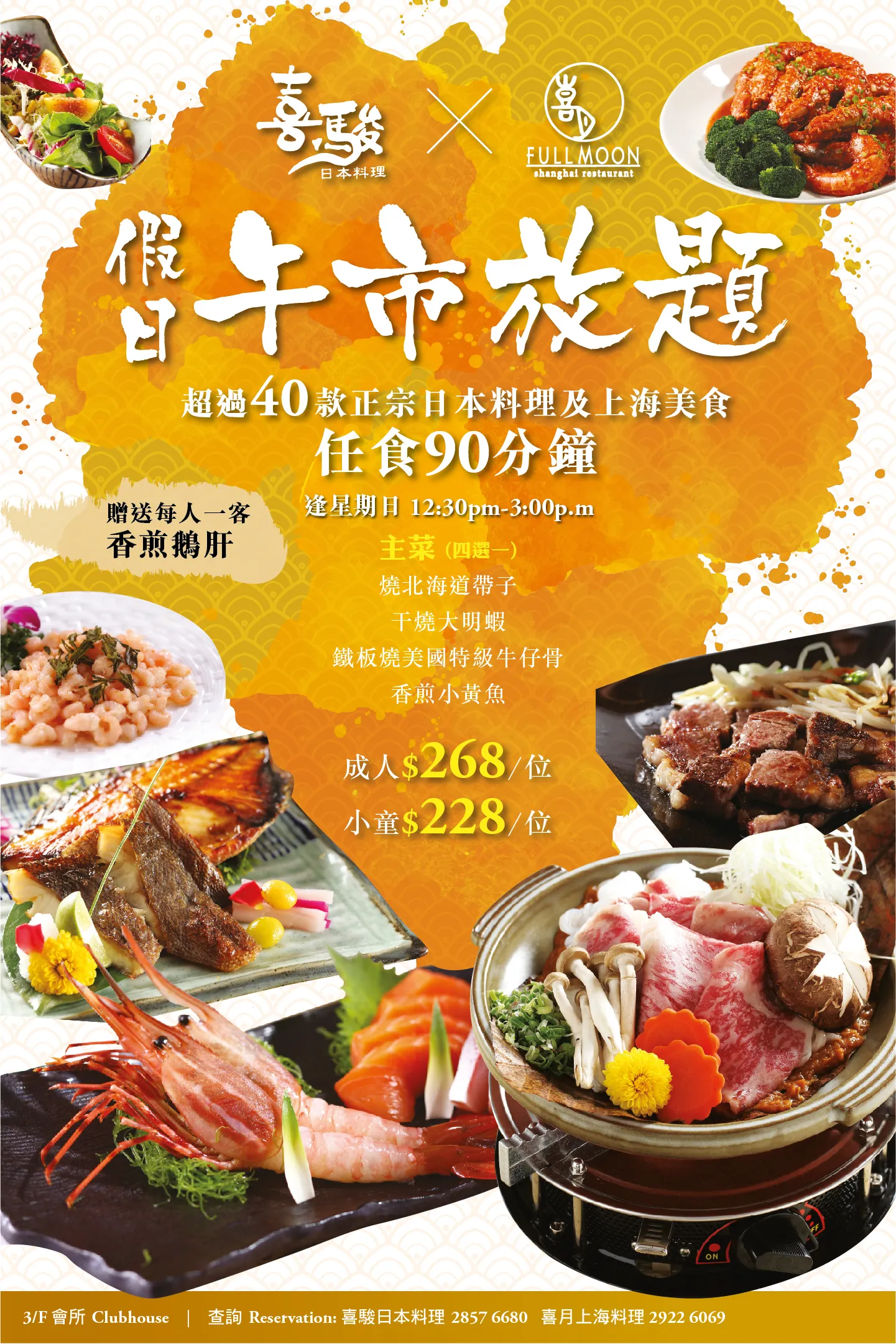
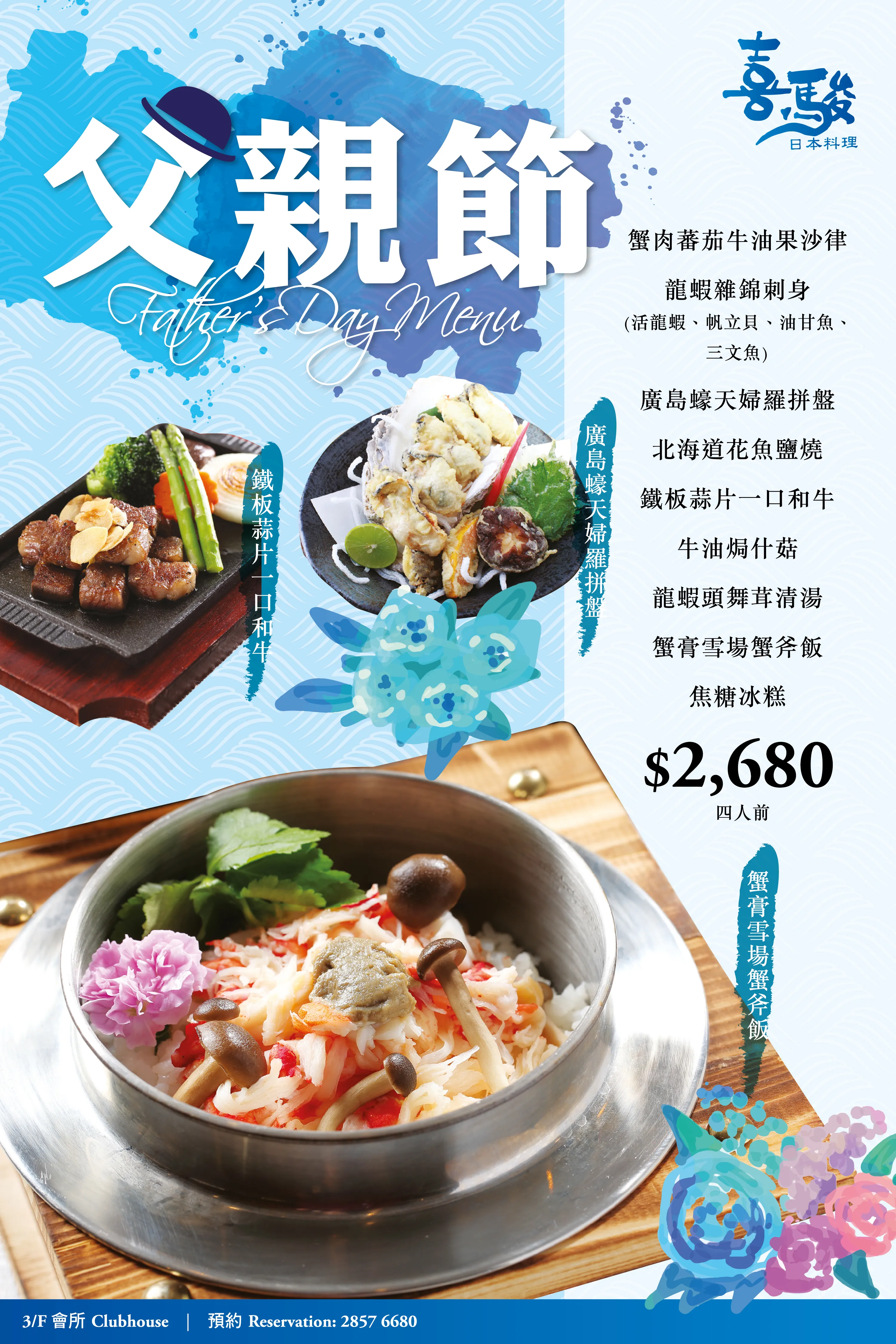
- Quarterly Rotation: Every three months, each restaurant’s poster would be updated to reflect seasonal ingredients, cultural festivals, or limited-time promotions (e.g. Chinese New Year, Mid-Autumn Festival, Winter Hot Pot Season, Spring Delicacies).
- Cultural Sensitivity & Thematic Relevance: The design needed to reflect regional culinary traditions and festival moods – such as red and gold for Lunar New Year, floral motifs for spring, or cool tones for summer seafood specials.
- Consistency Across Venues: While individual designs varied by restaurant theme, a baseline grid and brand alignment (e.g. logo placement, font pairing, and information hierarchy) was maintained for quality and efficiency.
- Print-Optimised Layouts: As these were large-format posters displayed in portrait orientation, high-resolution imagery, typographic clarity, and visual balance were crucial.
Each poster featured a combination of hero food photography, decorative accents, and well-organised copy blocks. Visual components included:
- High-impact dish imagery, professionally styled or retouched to highlight colour, texture, and plating
- Headline text that often combined Chinese and English, using calligraphic or serif styles for festive elegance, or clean sans serifs for modern promotions
- Decorative elements such as lanterns, seasonal foliage, origami patterns, or traditional Chinese brush motifs depending on the restaurant’s style
- Subtext and pricing information placed in easy-to-read zones with ample spacing, often at the lower third of the poster
- QR codes or booking prompts, added in later versions to integrate digital reservations or further details via smartphone scan
For example, a Mid-Autumn poster at Full Moon Shanghai Restaurant might feature mooncakes with golden lighting, stylised clouds, and jade-green typography, while a winter promotion at Yo Ro Ko Bu might showcase a hot pot set with cool steam effects and soft snowflake overlays.
Typography and colour palettes were carefully curated per theme:
- Golds, deep reds, and traditional patterns for Chinese festivals
- Soft pastels and natural tones for spring and wellness menus
- Cool blues and sharp whites for summer seafood offerings
- Warm earthy hues and textured backgrounds for autumn and winter menus
Posters were printed on premium coated stock for durability and colour vibrancy, sized to fit standard display frames used throughout the clubhouses. Mock-ups were shared with the client in each design round, allowing food managers and marketing staff to provide feedback on dish names, pricing details, and seasonal messaging before print.
For enhanced cohesion, matching smaller-format collateral (such as tabletop cards or lift lobby mini-posters) were occasionally created using adapted layouts from the main design.
The restaurant poster display project for the Macau Jockey Club’s group of restaurants represents a continuous and evolving collaboration where design meets appetite. Balancing cultural resonance, visual sophistication, and promotional clarity, each poster plays a vital role in enhancing the dining experience while driving engagement with seasonal offerings.
It is a project that demonstrates the power of consistency and creativity – where quarterly rhythm becomes a canvas for visual storytelling through food.
