STEM Courses & Activities Brochure
Designing a brochure is more than just arranging text and images on a page. It is about telling a compelling story that resonates with the target audience, guiding them through information in a way that is both structured and engaging. For this particular project, we were commissioned to create a bilingual brochure for a STEM education provider, aimed specifically at schools. The client needed a visually cohesive, professionally presented, and easy-to-navigate publication to promote their extensive range of STEM courses and hands-on learning activities.
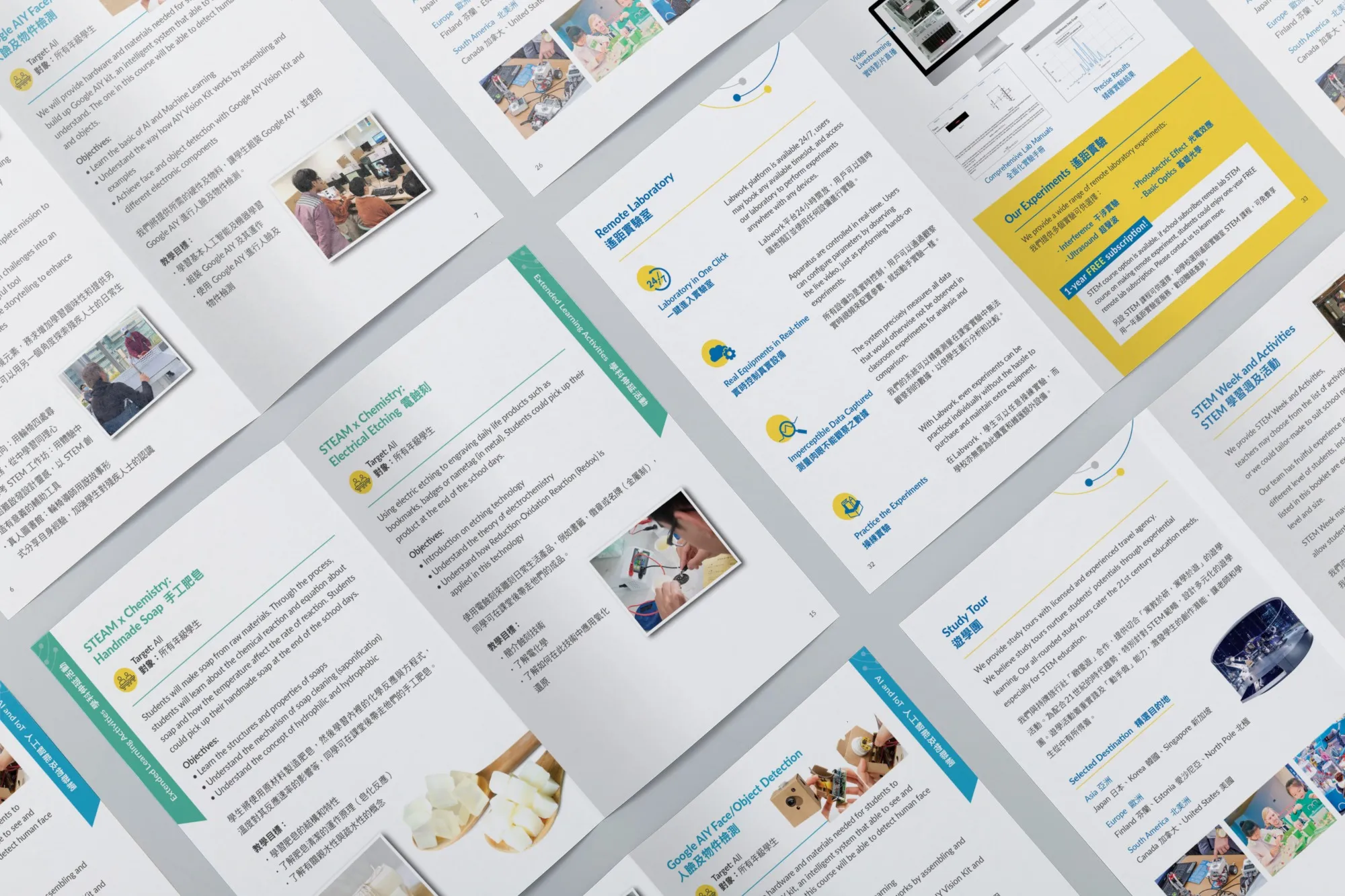
A key challenge of this project was its bilingual requirement. The brochure had to be presented in both English and Chinese, catering to Hong Kong’s multilingual education environment. Rather than simply duplicating each page, we opted for a carefully considered layout strategy that allowed both languages to coexist harmoniously. Headings, subheadings, and key messages were designed to appear parallel across languages, with typographic hierarchy ensuring that neither language felt secondary. Careful attention was given to line spacing, word length, and character balance, particularly when working with Chinese typography, to avoid visual congestion and maintain elegance.
The successful launch of the brochure resulted in positive feedback from schools and stakeholders, with many highlighting the ease of use, professional appearance, and clear messaging. It serves as a strong example of how thoughtful design, rooted in both function and form, can support educational initiatives and help brands stand out in a competitive and meaningful way.
