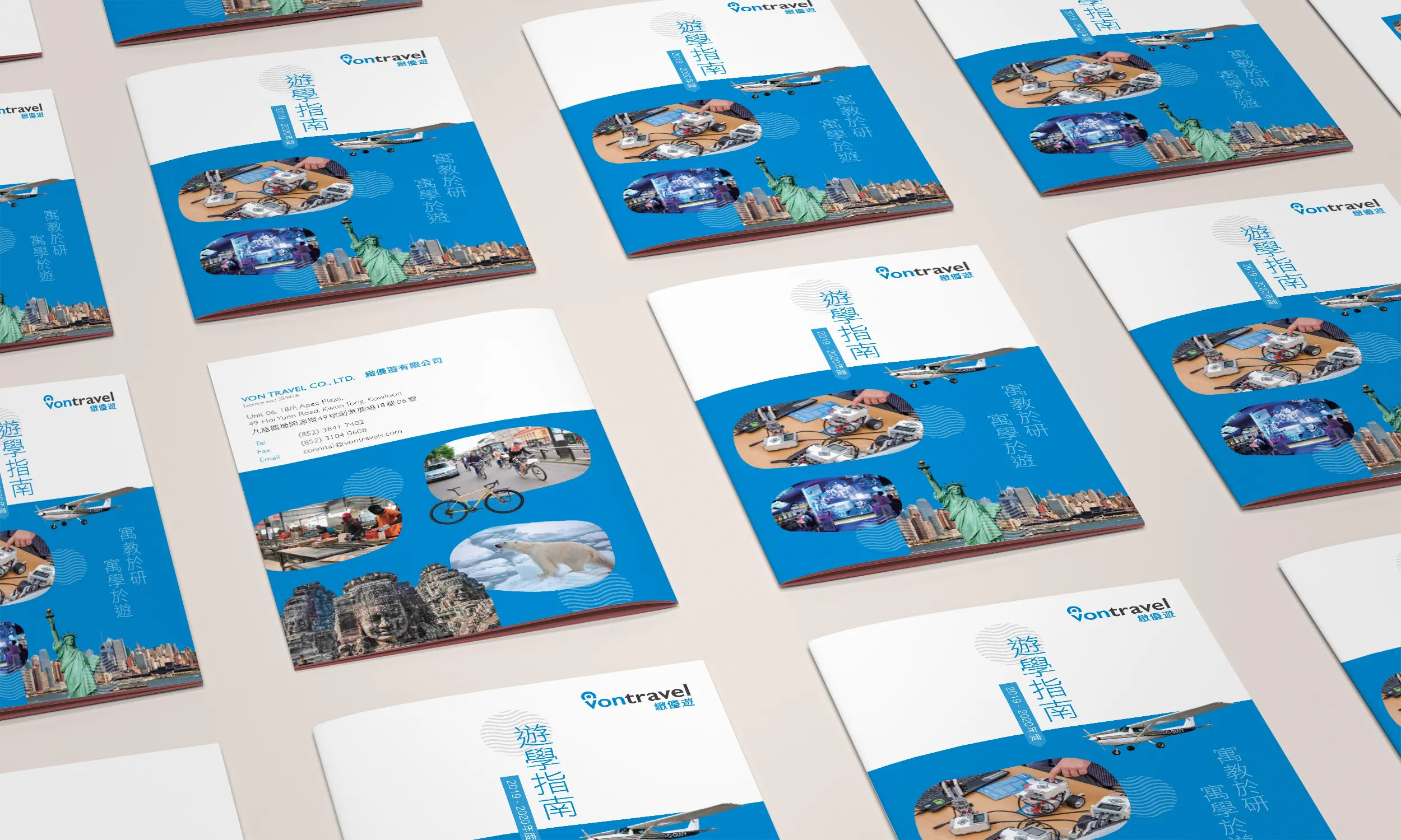
Study Tour Brochure
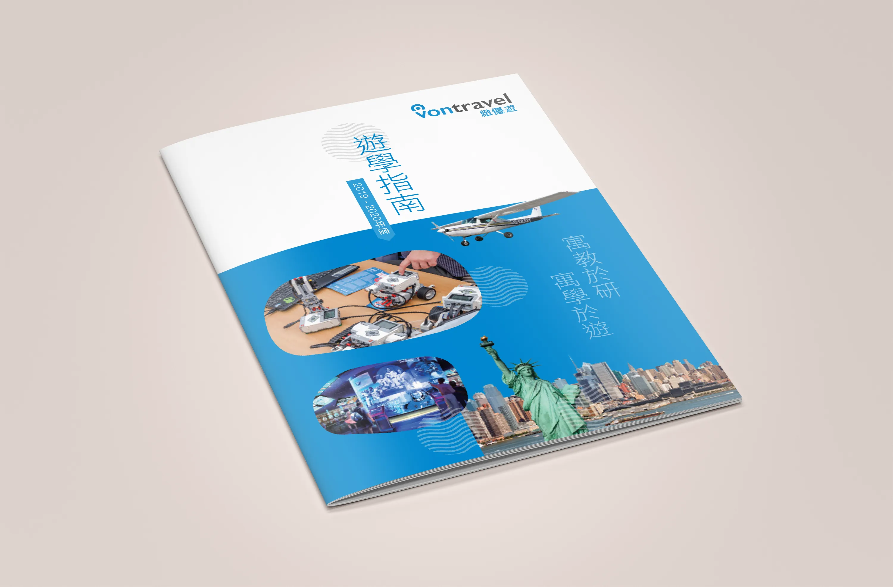
In a world where education is no longer confined to classrooms, study tours have become an essential bridge between theory and real-world experience. The Study Tour Brochure project was developed as part of a broader marketing and advertising campaign for a travel agency specialising in educational tours for Hong Kong primary and secondary school students. The objective was to create a compelling brochure that could inform, inspire, and persuade decision-makers, school principals, teachers, parents, and students, to explore learning opportunities beyond borders.
The brochure needed to serve multiple functions at once:
- Present diverse travel destinations in an educational context
- Showcase sample itineraries with clear learning objectives
- Instil confidence in parents and school administrators about safety and value
- Visually differentiate between destinations while maintaining brand consistency
- Work effectively in both print format (for events, school visits, and expos) and digital PDF format (for email marketing and online access)
In short, this was not just a promotional piece. It was a strategic educational marketing tool.
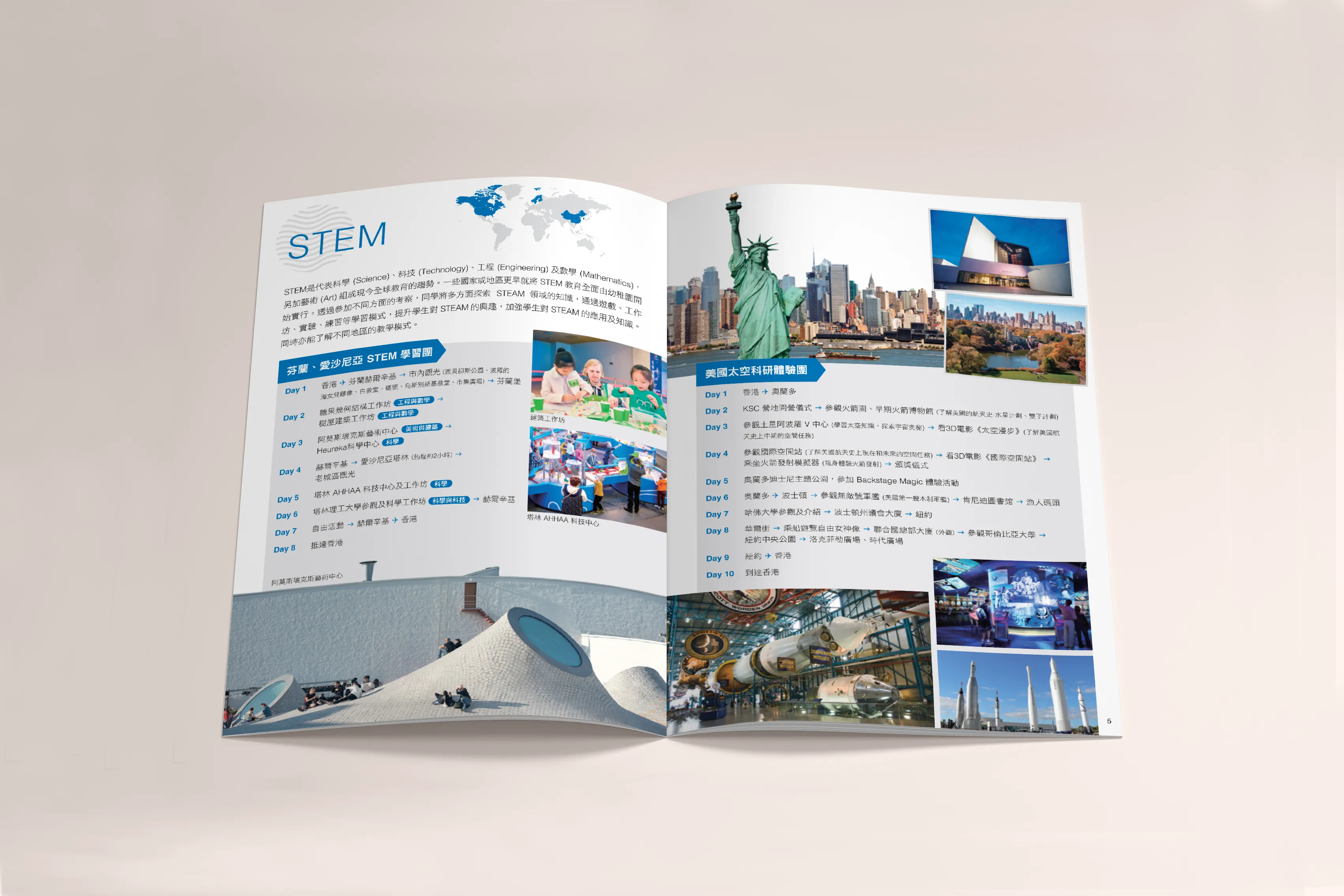
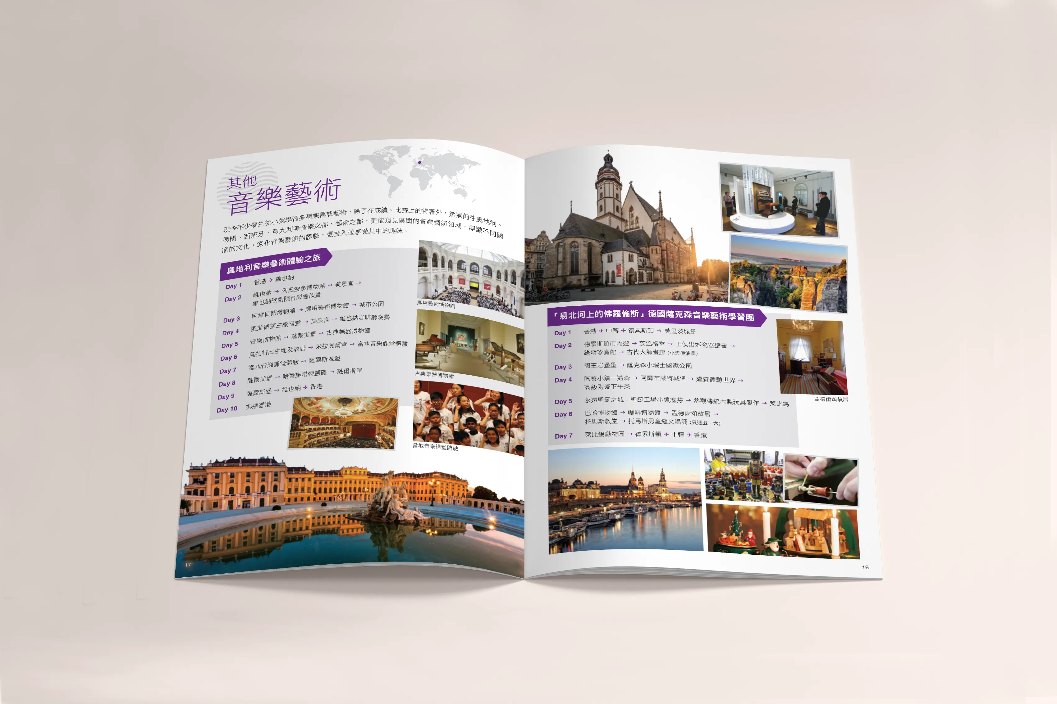
To accommodate a wide range of destinations and tour types, the content was divided into modular, destination-based sections. Each destination followed a consistent format to help educators and administrators compare offerings easily:
- Introduction Page Each section began with a regional overview. Highlighting key educational values, cultural significance, and unique selling points of that destination. This included photography, statistics, and curated quotes from past participants.
- Attractions & Learning Themes A visually engaging spread detailed notable sites and activities, museums, universities, factories, natural reserves, science centres, and cultural exchanges. Icons and themed colour markers (e.g. science, history, arts) helped categorise content and make browsing intuitive.
- Sample Itineraries Carefully designed daily schedules provided a realistic view of how a 3-day to 7-day tour would be structured, including meals, accommodation types, and educational goals for each stop. Each itinerary was paired with a location map and travel logistics overview.
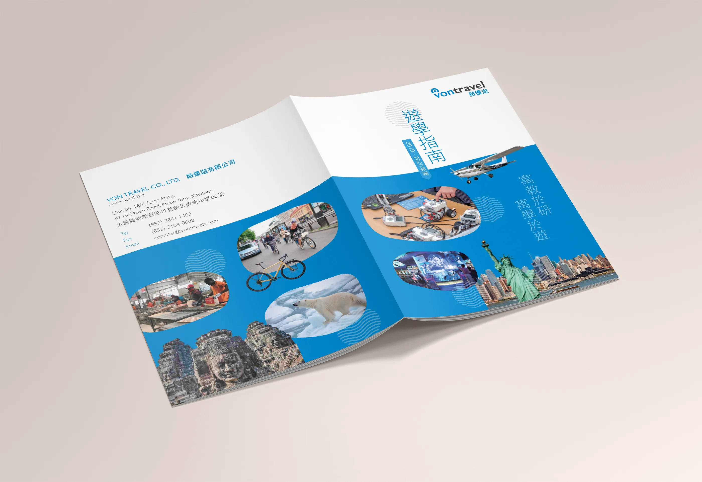
- Safety, Accreditation & Testimonials A final section reinforced the trustworthiness of the agency, listing health and safety protocols, travel insurance partnerships, teacher support services, and quotes from school clients or parents. This built reassurance into the back pages of the brochure.
The design direction aimed to balance credibility with inspiration, creating a publication that looked both professional and exciting. Key visual elements included:
- Destination Colour Coding: Each tour section was assigned a colour palette inspired by the country or region’s visual identity (e.g. green tones for New Zealand, red and gold for China, blue for Japan), aiding both navigation and aesthetic variety.
- Grid-Based Layout: A structured grid system ensured that despite the volume of information, the layout remained readable, consistent, and digestible. Ample white space was used to reduce visual fatigue and support clear hierarchy.
- High-Quality Photography: Images were chosen to depict not just tourist landmarks, but authentic learning moments, students in labs, group discussions, nature excursions, and intercultural experiences.
- Custom Icons & Infographics: Educational themes, safety assurances, and itinerary timelines were all supported with bespoke iconography and visual cues, enhancing accessibility for all readers including younger students or ESL parents.
Typography was modern, friendly, and legible. We used sans serif fonts for body text to keep it clean and professional, while allowing more expressive type treatments for headlines and section dividers.
The print edition was produced in A4 portrait format, saddle-stitched, with a laminated cover for durability during repeated handling at school events or exhibitions. The digital edition was formatted as an interactive PDF with clickable table of contents, embedded hyperlinks to enquiry forms, and compression optimised for school intranet and mobile sharing.
Flyers, event backdrops, and social media banners were also designed to maintain consistency across all touchpoints of the tour promotion campaign.
The Study Tour Brochure became a central marketing asset for the travel agency’s school outreach programme. It was widely distributed at education expos, school visits, and parent information nights, and received strong positive feedback from educators who appreciated its clarity, structure, and visual appeal.
The digital version saw high download and open rates via email campaigns, while the print version continued to be a go-to resource for school trip planning sessions. The success of this project also led to the development of a follow-up promotional booklet tailored specifically for university-level cultural immersion programmes.
The Study Tour Brochure demonstrates how purposeful design can elevate marketing materials into trusted educational resources. With a reader-first layout, emotionally resonant visuals, and clear messaging, it speaks directly to the needs of educators, parents, and young learners. It is not just about where students can go, but what they can discover and how design can help them imagine it.
