Taiwan Study Tour Brochure
Designing educational travel brochures requires more than just visual flair. It involves structuring content to inform, engage, and guide decision-makers, often within a limited timeframe and space. The Taiwan Study Tour Brochure, produced annually for Lotus Tours, is a strong example of how clear visual design, functional layout, and content-driven storytelling can come together to create an effective marketing tool for schools.
Lotus Tours has long been an established name in the school travel sector, known for offering curated study tours that blend cultural, environmental, and historical learning experiences. Their Taiwan Study Tour programme has been particularly successful, providing immersive educational journeys across different regions of Taiwan. Each year, the brochure is mailed directly to primary and secondary schools in Hong Kong, serving as both an informational piece and a persuasive proposal that schools can use when planning cross-border academic excursions.
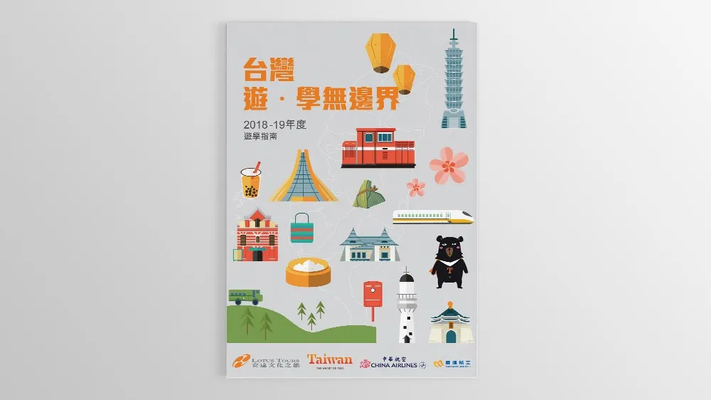
The brochure’s concept is rooted in clarity, structure, and regional distinction. Taiwan, despite its size, offers a remarkably diverse set of experiences depending on geographical region. To reflect this, we structured the content into five main sections, each corresponding to a specific region of Taiwan (Northern, Central, Southern, Eastern, and the Outlying Islands). This classification not only mirrored how local travel is planned but also allowed for the creation of a modular visual system that improves comprehension and reader flow.
To support this organisation, we implemented a colour-coded system, assigning a unique colour to each geographic area. This intuitive approach allows readers to easily differentiate between sections at a glance, both through the printed tab indicators and subtle page header accents. For example, the Northern region may use a cool tone such as blue or teal to represent metropolitan sophistication, while the Southern region could be linked with warmer, earthier tones to convey cultural richness and tropical vibrancy.
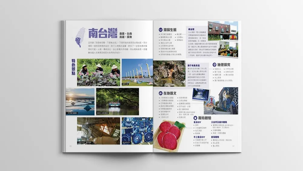
Each regional section is spread across four dedicated pages, designed with a clear editorial structure:
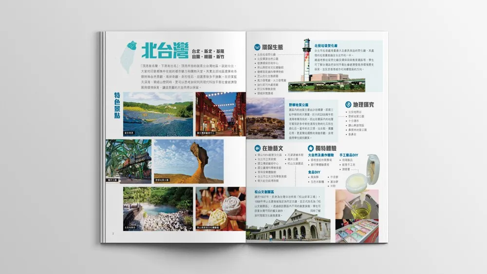
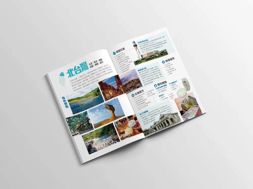
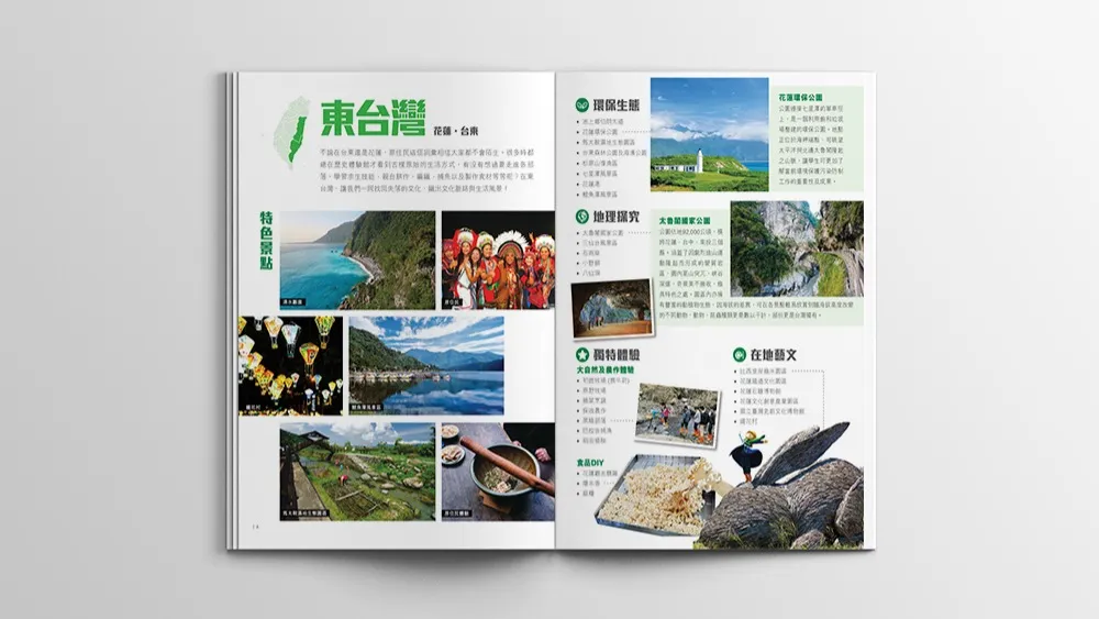
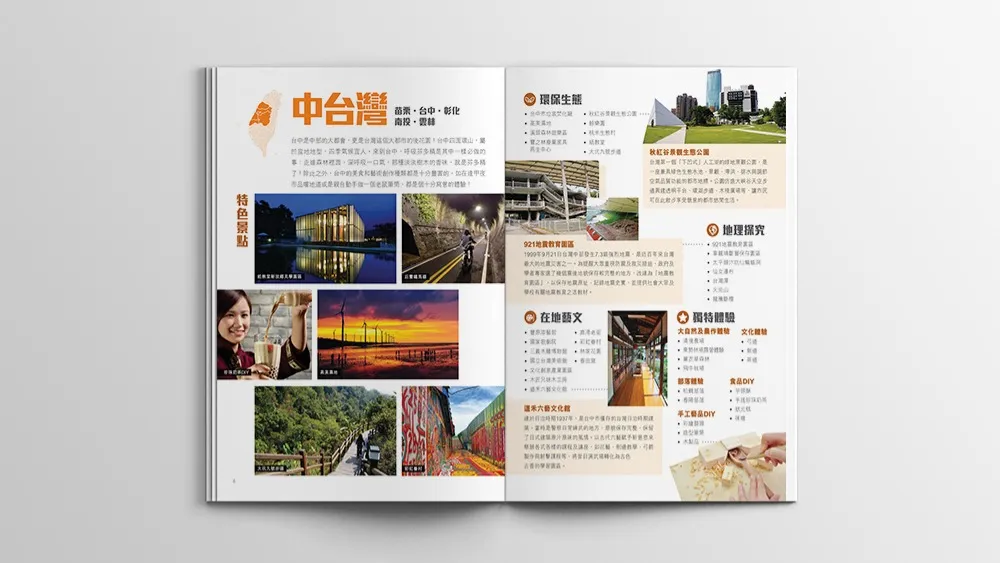
- Page One serves as an introduction to the region, highlighting the unique qualities and educational value it offers. This may include cultural landmarks, distinctive industries, or ecological features that make the area a rich environment for learning.
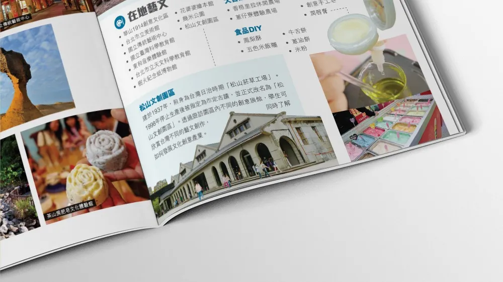
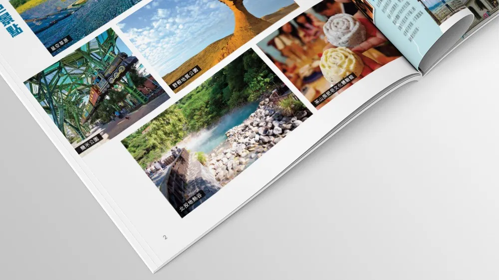
- Page Two presents a catalogue of attractions, organised by theme, such as history, science, arts, environmental studies, or local culture. Each attraction is accompanied by concise descriptions and photographs, making it easier for educators to identify what aligns with their teaching goals.
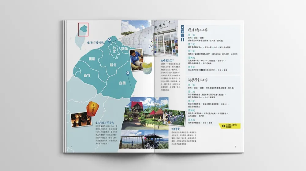
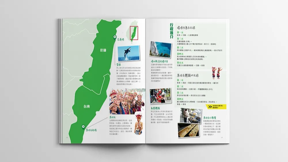
- Pages Three and Four shift focus to practical planning, offering sample itineraries that showcase how schools can structure their tours. These suggestions are designed to be flexible and customisable. A map of the region is also provided, highlighting key locations and allowing readers to visualise the journey. Icons and visual cues were used to illustrate travel time, activity type, and intensity, enabling faster comprehension for busy readers.
Typography was carefully chosen to balance readability with a friendly, modern appearance, particularly important when the material is aimed at both administrative staff and young students. Fonts were selected for their clarity at small sizes, and we used a consistent hierarchy throughout, with bold headings, informative subheadings, and legible body text.
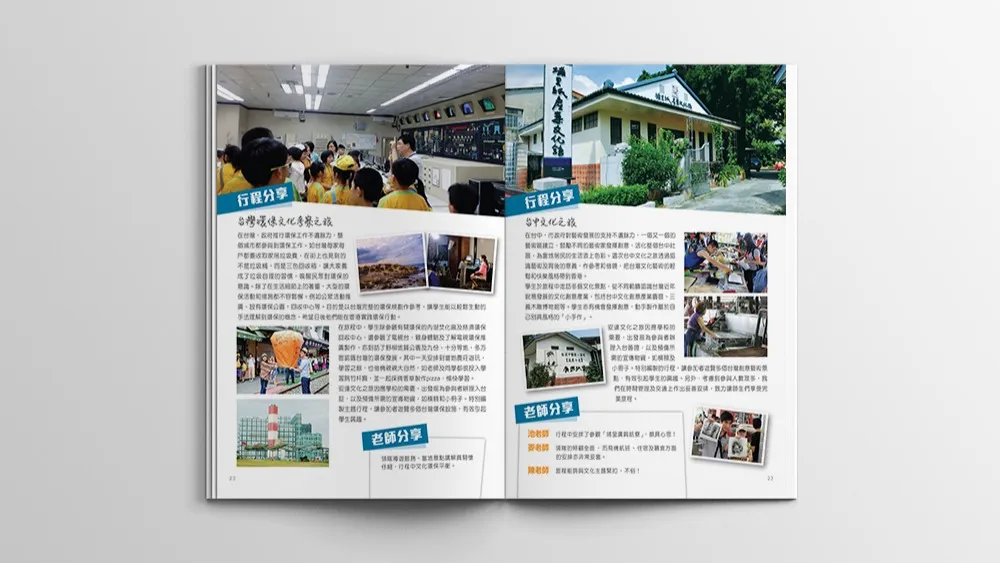
Images were handled with equal care. To avoid visual clutter, we curated a set of photographs that showcased student engagement, cultural immersion, and the scenic beauty of Taiwan. Each image was selected not only for aesthetic quality but for its ability to reinforce the educational themes presented in the text. Strategic use of white space ensured the content remained breathable and approachable, despite the richness of information.
Print production considerations were also essential, as this brochure is a physically mailed item. We opted for a standard A4 size with a saddle-stitched spine for ease of filing and photocopying. Paper stock was chosen for durability, with a semi-matte finish that offers both tactile quality and colour vibrancy without glare. The brochure was also prepared in a digital format for school websites and email circulation, with interactive links and optimised images to ensure quick loading and accessibility.
Ultimately, the Taiwan Study Tour Brochure stands as an example of functional yet refined educational marketing. It communicates clearly, guides effortlessly, and invites schools into a world of cultural discovery. For Lotus Tours, this brochure has become a trusted yearly campaign tool. One that not only informs but inspires schools to offer meaningful travel experiences that enrich students’ academic and personal growth.
