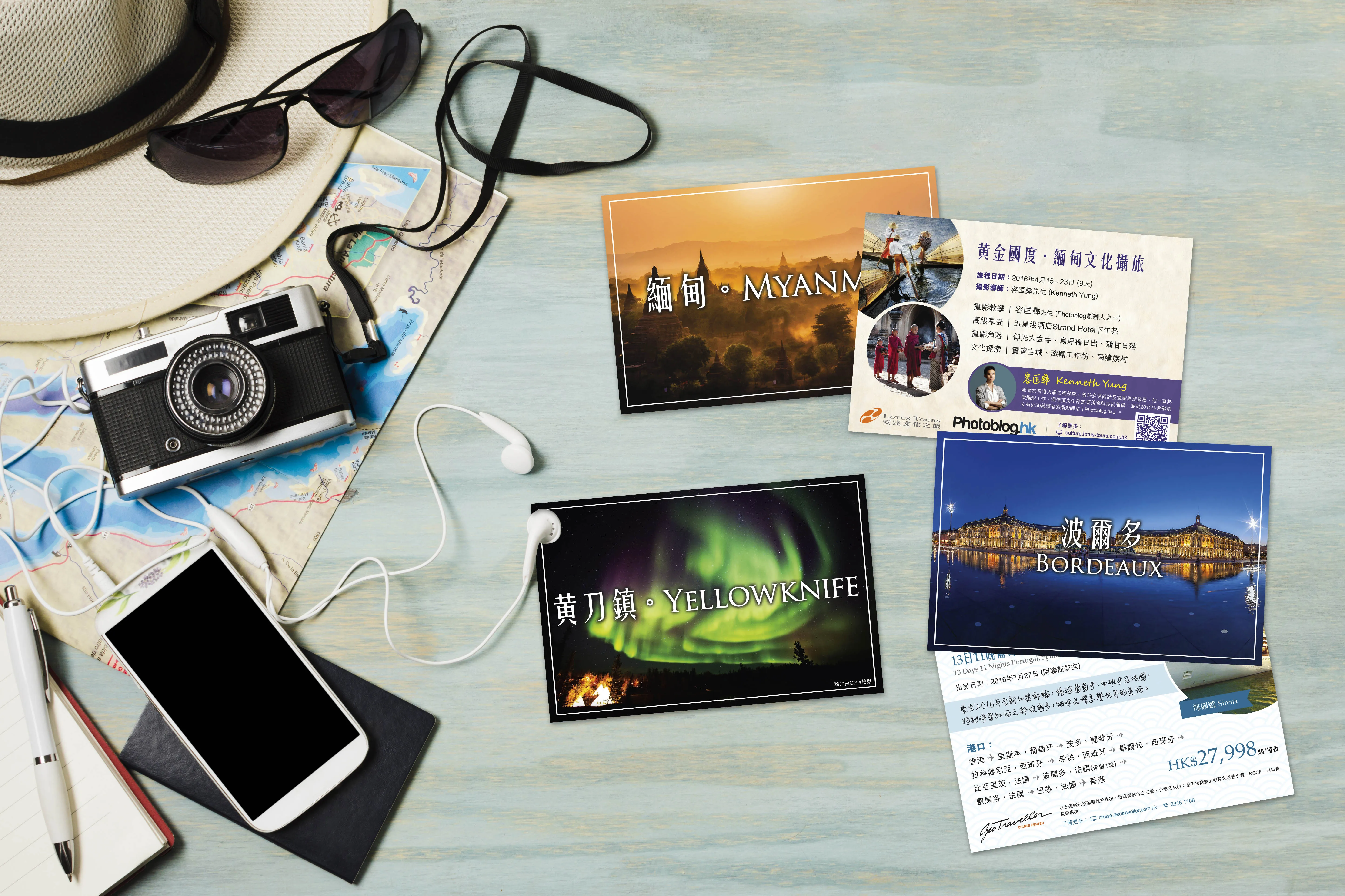
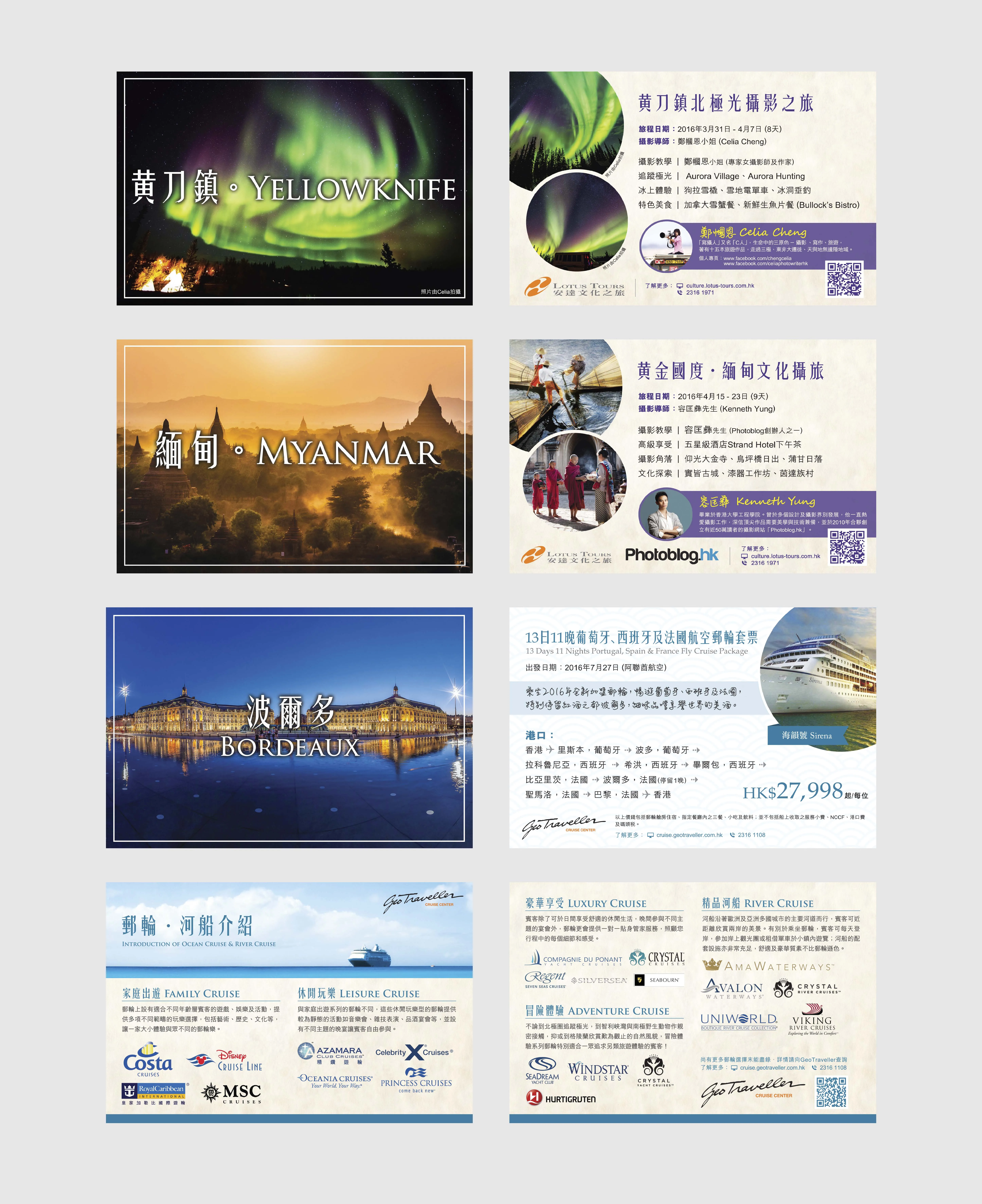
Tour Promotion Card
In a digital-first era, print remains a powerful way to make personal and physical connections, especially in spaces where audiences are already in discovery mode. The Tour Promotion Card was conceived as a compact, high-impact marketing piece to complement broader advertising campaigns for curated tours. These cards were strategically designed and distributed to engage potential travellers in lifestyle spaces, providing a tactile experience that encouraged exploration beyond the screen.
Unlike standard leaflets or bulky brochures, this card format allowed for targeted outreach, particularly to those with an appreciation for art, photography, wine, and storytelling, all values reflected in the nature of the tours themselves.
The tour being promoted was typically thematic or experiential in nature, such as photography-focused journeys, wine tasting trips, heritage explorations, or cultural immersion tours. Rather than relying solely on large-format advertisements or digital campaigns, the client wanted to create something personal, collectable, and easy to distribute at curated locations.
The card’s purpose was simple:
- Introduce the tour concept quickly and clearly
- Spark curiosity through compelling visuals
- Provide just enough detail to prompt further action (e.g. visiting a website, scanning a QR code, or contacting the organiser)
To meet these goals, the layout needed to balance visual appeal, concise messaging, and practical usability, all within a limited space.
The promotion cards were placed in:
- Independent bookstores – often located near travel, design, or photography sections
- Cafés and lifestyle venues – places where customers have time to browse, reflect, and pick up something of interest
- Events – such as Photography Sharing Sessions, Wine Tasting Nights, or Cultural Talks, where the audience aligns closely with the tour theme
These channels were selected for their intimate, high-quality audience reach, and the card design was tailored to match the aesthetics of these spaces, inviting, refined, and in tune with the setting.
The card was designed to be compact yet impactful, usually printed at A6 or DL size. The creative approach followed these principles:
- Front Side: Visual Hook A high-quality, emotionally resonant photo that captured the essence of the tour. For example:
- A golden-hour vineyard for a wine tour
- A quiet temple corridor for a cultural trip
- A dramatic mountain landscape for a photography expedition
This image acted as a visual invitation, free from clutter and paired with a minimal headline, often the name of the tour or a tagline like “Discover Stories Through the Lens” or “A Journey for the Senses”.
- Back Side: Tour Details & Highlights The reverse side included:
- A short description of the tour’s theme, experience, and value
- Key highlights (destinations, special activities, dates, or guest speakers)
- Contact details and QR code leading to the tour webpage
- Social media handles or a call-to-action such as “Scan to reserve your spot”
To improve scanability and elegance, we used:
- A consistent typographic hierarchy, combining a modern serif or sans serif for the body copy and stylised headers for section titles
- Grid alignment for clean spacing and information flow
- Visual cues like small icons or bullets for quick reading
- Subtle branding elements in line with the organiser’s main visual identity
The result was a card that felt premium and intentional, making it more likely to be kept, pinned, or handed along.
The production values matched the card’s design intent:
- Thick, matte-finish stock to create a durable and tactile piece
- High-resolution CMYK printing to ensure photographic detail and colour fidelity
- Rounded corners in some versions for added softness and differentiation
Some batches were printed in limited runs tied to specific events, using gold foil accents or textured paper for a luxury touch.
The Tour Promotion Card received strong anecdotal feedback from event hosts and venue partners. People picked them up, read them, and scanned the QR codes, especially at themed events, where the context aligned perfectly with the audience’s interests.
The client reported an uptick in direct enquiries and website visits correlated with each event or placement cycle, validating the strategy of contextual, offline touchpoints as a complement to digital outreach.
Beyond numbers, the cards also helped build brand presence, positioning the tour organiser as thoughtful, tasteful, and focused on quality experiences. They worked not just as adverts, but as conversation starters and takeaway artefacts that invited readers to imagine themselves on the journey.
The Tour Promotion Card project shows how layout design can extend beyond large-format or online tools to create small, strategic, and high-quality print pieces. By focusing on design elegance, clear messaging, and audience alignment, this format proves especially effective in lifestyle and experiential travel marketing. It’s not just about informing, it’s about inspiring the next adventure, one card at a time.
