Von Travel
When we think about travel, the imagery that comes to mind often feels familiar, postcards, checklists, tourist hotspots. But Von Travel seeks to shift that mindset. As a travel agency offering cultural and thematic experiences, Von Travel promotes a deeper, more personal connection to the world. Their vision is to inspire individuals to explore with freedom and flexibility, encouraging a lifestyle where travel is not just a holiday, but a meaningful journey that influences and enhances life itself.
Von Travel’s philosophy centres around delivering non-traditional travel products that are crafted with thoughtfulness and quality. Rather than package deals and rigid itineraries, the agency provides curated cultural adventures, local immersion, and theme-based itineraries that resonate with open-minded travellers looking for authentic experiences. This fresh approach to travel needed a brand identity that broke from convention, while still communicating professionalism, trust, and clarity.
The brief was both exciting and clear: design a brand identity that reflects freedom, cultural depth, and a modern outlook, without relying on clichéd travel motifs. The identity had to speak to curious travellers, lifestyle seekers, and individuals searching for meaning in their journeys, a demographic often overlooked by mass-market travel brands.
Our process began by understanding what freedom and flexibility look like from a visual perspective. These are abstract concepts, but when translated into brand design, they often take the form of openness, lightness, and motion. We avoided static or rigid visual structures, instead opting for fluidity, balance, and clean lines.
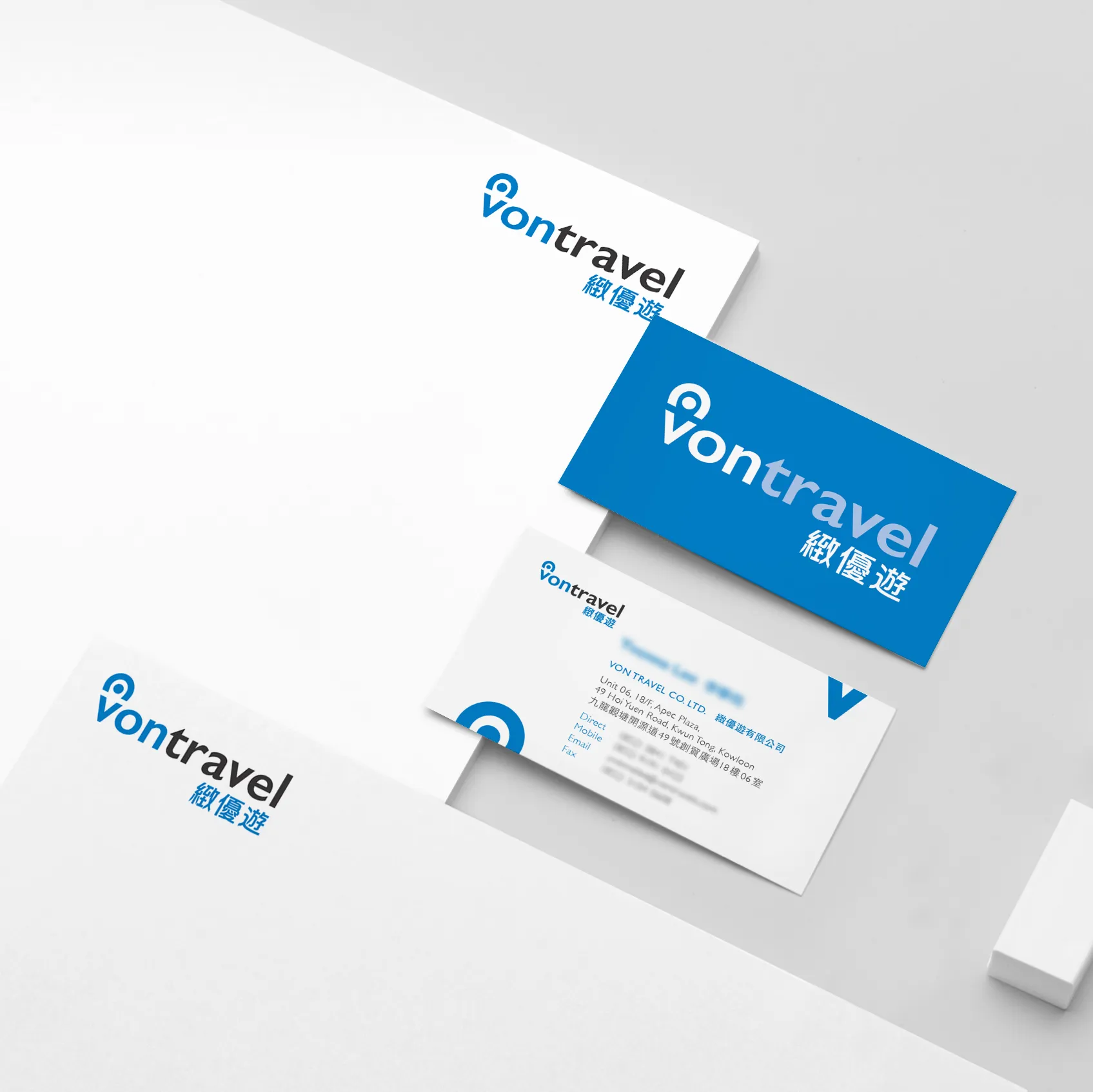
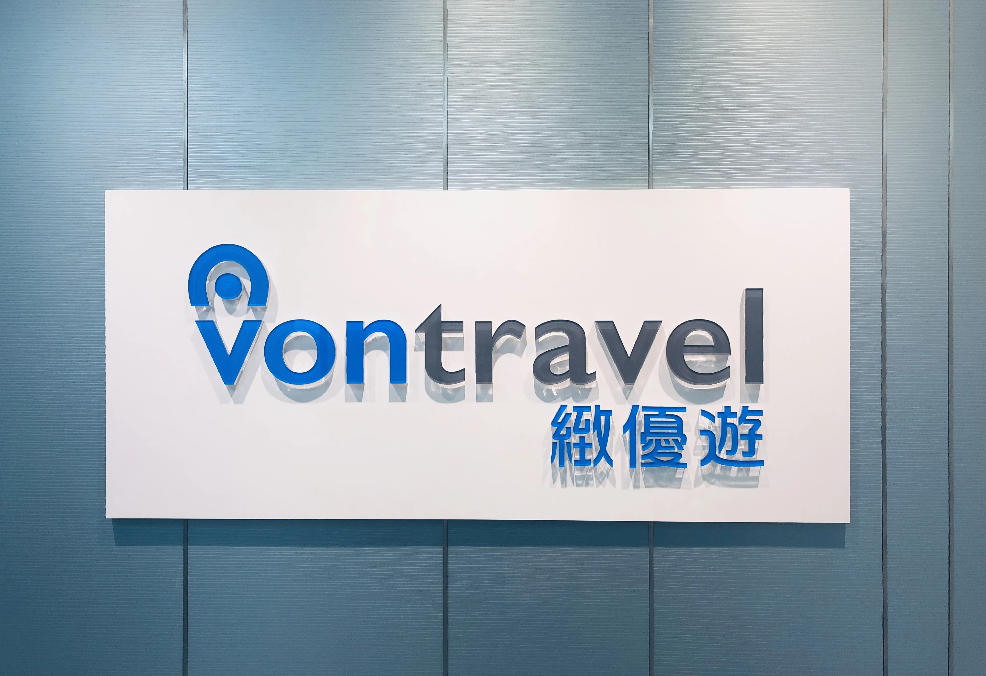
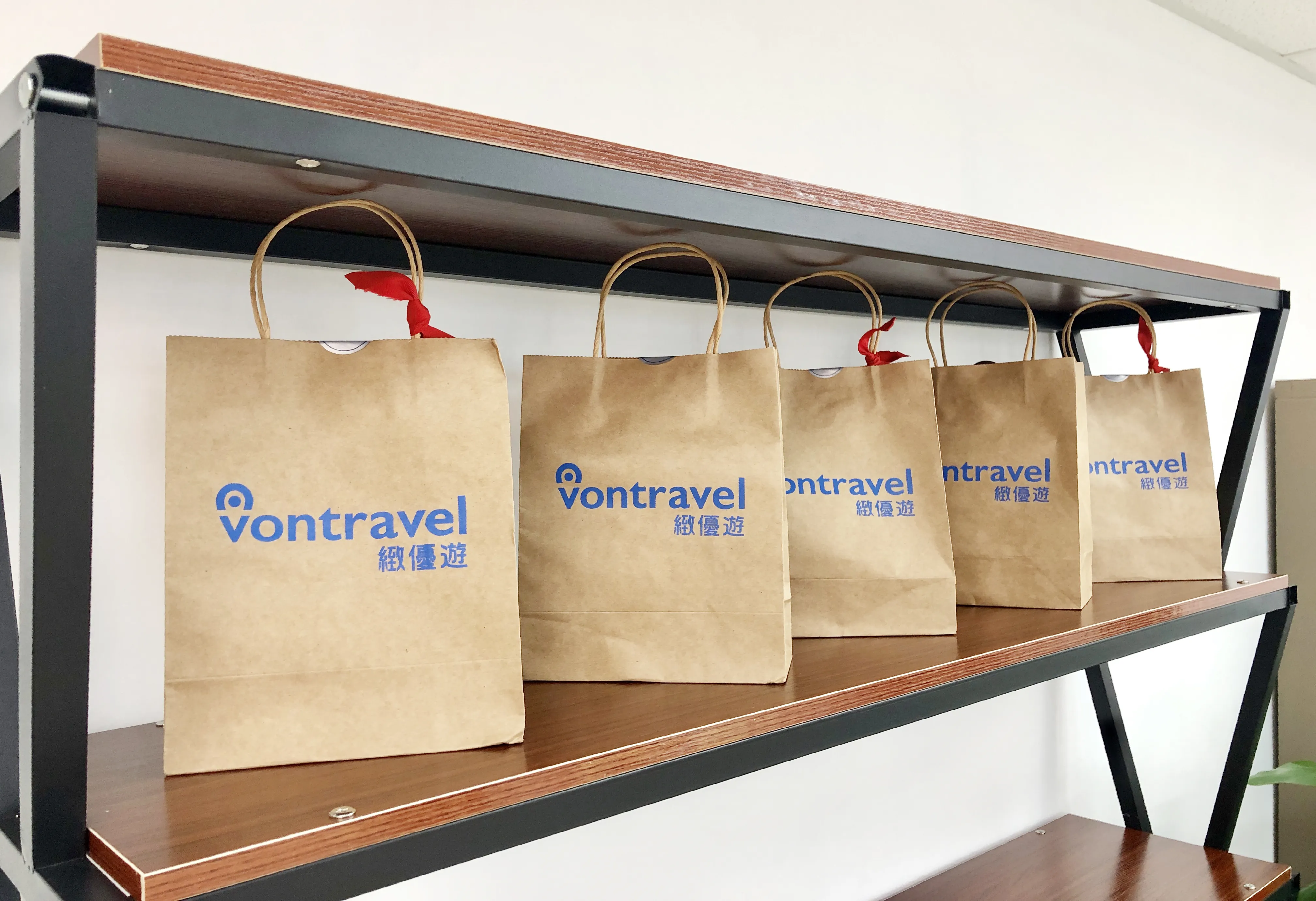
The logo design is at the heart of Von Travel’s visual identity. It features a custom logotype using a carefully chosen sans serif typeface, modified to include smooth curves and open letterforms that convey a sense of movement and ease. The letters ‘V’ and ‘T’ were given subtle flourishes, evoking the idea of a path or journey, not with obvious icons like planes or suitcases, but through abstract visual cues that appear in every exploration. This approach keeps the design timeless and sophisticated, while allowing the brand to grow into different travel niches.
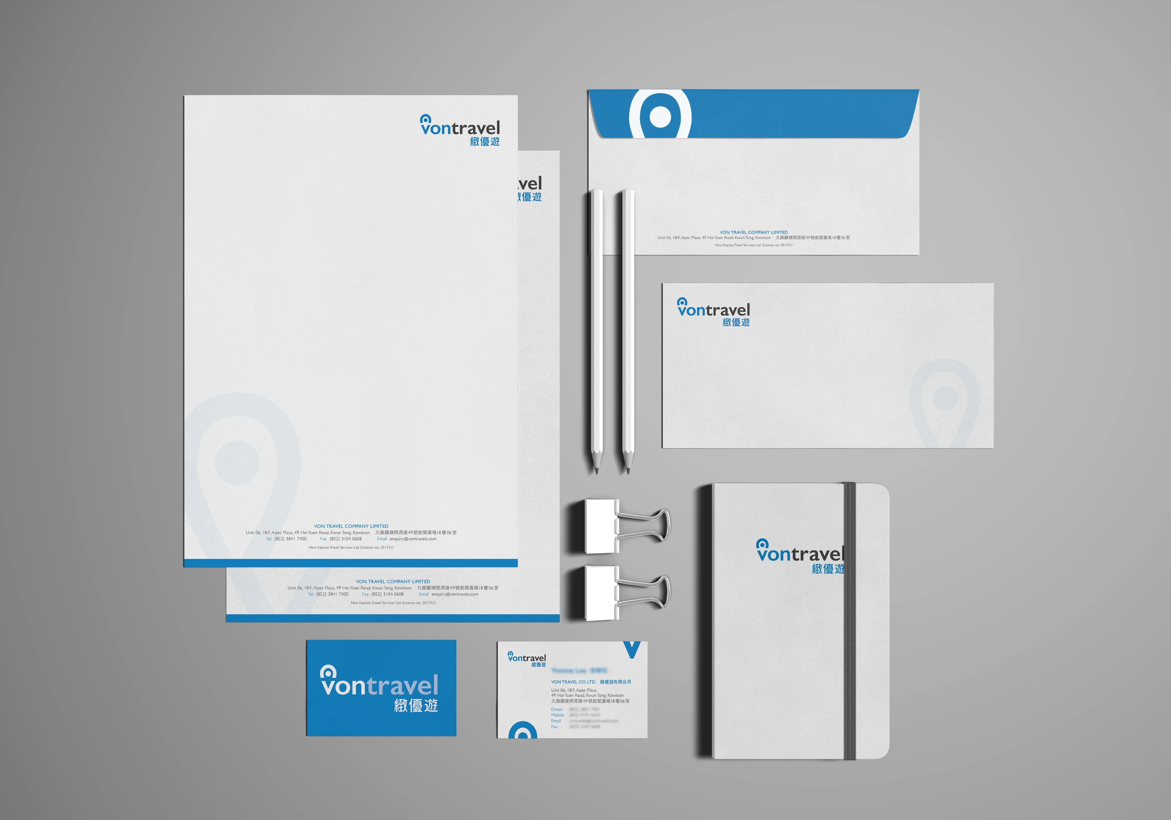
The colour palette was selected to balance freshness with warmth. Soft earth tones paired with a light blue evoke both the grounded cultural richness of destinations and the openness of the sky, freedom above and roots below. These colours were used consistently across print and digital formats, creating harmony throughout the brand’s touchpoints.
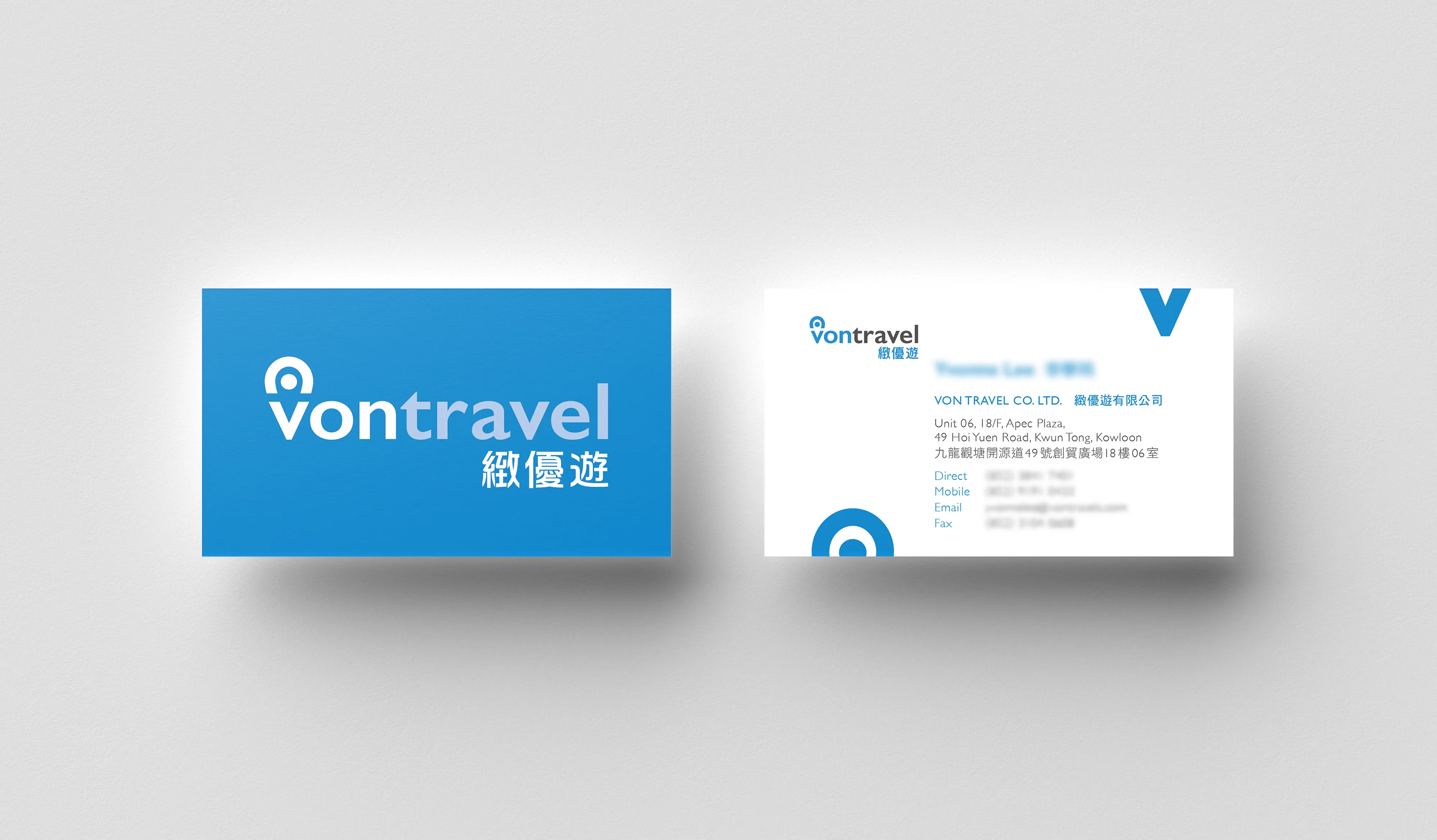
For the business card and stationery design, the objective was to maintain a minimalist yet elegant layout. Contact details were arranged in a way that reflects clarity and order, while still leaving room for generous white space, an intentional nod to the “breathing room” concept central to Von Travel’s flexible philosophy. The reverse of the business card features the full logo mark in colour, allowing it to stand out as a symbolic representation of the brand in networking or presentation settings.
The stationery set includes a letterhead, envelope, and notecard, all aligned to a cohesive grid system. We introduced a set of subtle graphic elements (light lines and geographic-inspired patterns) to bring in a thematic sense of travel without overwhelming the simplicity of the layout. These details serve to elevate the perceived value of the brand, making each touchpoint feel considered and connected.
One of the most important aspects of the identity system was scalability and adaptability. As Von Travel planned to roll out both physical brochures and an online booking experience, we developed a flexible identity guide that ensures consistency across mediums. This included logo usage rules, colour specifications, font guidance, and template suggestions. By equipping the client with these tools, we empowered them to maintain brand integrity as they grow.
The final brand identity for Von Travel does more than provide visual polish. It tells a story of possibility. It speaks to those who seek travel that enriches rather than distracts, and offers a sophisticated yet accessible visual presence in a crowded market. The brand stands as an invitation to rethink what travel can be. Not a rush from one sight to the next, but a thoughtfully curated experience that expands the mind, stirs emotion, and leaves a lasting impact.
From logo to letterhead, every element of Von Travel’s identity was crafted to embody this ethos. A modern compass for a new generation of travellers.
